An Exploration of Techniques Used in Data Analytics to Produce Analysed Data in Graphical Format
Info: 22483 words (90 pages) Dissertation
Published: 11th Dec 2019
Tagged: Statistics
An exploration of techniques used in Data Analytics to produce analysed data in graphical format.
4.2 A brief history of Big Data
4.5 Data terms used in Data Analytics
3. Clustering/Cluster analysis
4.6 Relationship between Big Data and Data Analytics
4.7.1 Datasets – File Extensive
4.8 Techniques use in Data Analytics/Data Science
4.9.1 Programming Languages used in Data Analytics
4.9.2 R – Programming Language:
4.9.3 Python – Programming Language:
4.9.4 Comparing the Languages:
5.1 Overview of the project software requirements
5.2 Functional Requirements Diagram:
5.2 Non – Functional Requirements
5.3 Non – Functional Requirements
6.1 Diagrams illustrating the Overview of the project:
6.2 Overview of Data flow diagram:
7.2.A Data – Streaming the data:
7.3.1 Cleaning the preparing the Food Balance Dataset:
Importing the datasets – Food Balance
Cleaning and preparing – Food Balance
7.4.1 – Food Balance dataset – Analysing and Extracting of the Data:
7.5.1- Food Balance dataset -Visualization of the results
7.2.B Data – 2. Diabetes prevalence (% of population ages 20 to 79):
Description -2. Diabetes prevalence
7.3. 2 Importing the datasets – Diabetes prevalence
Cleaning and preparing – Diabetes prevalence
8.1.A Data – Streaming the data:
8.1.B.1 Data – Food balance – Ireland output – A
8.1.B.3 Data – Food balance – U.K output
8.1.B.4 Data – Food balance – Comparing U.K and Ireland
8.1.B.5 Diabetes for population ages 20 to 79
9.1 Result of the requirements (functional and non-functional):
9.1.A Data – Streaming the data:
9.1.B Data – Diabetes for population ages 20 to 79:
Demonstrate on how to install the relevant package
Appendix -Section 2- Python scripts used to stream data
A. Python Scripts used to stream sugar tweets:
B. File located in containing the relevant tweets:
D. Append script to show split tweets only:
E. Output of spilt tweets in Notepad:
F. Script used to produce chart:
Appendix-Section 3 – Cleaning and preparing the data
A. Script used to apply the describe command and the results from the command:
B. Python scripts used to produce charts before cleaning and preparing the data:
Box plots using random numbers:
C. Python Code – cleaning and preparing the data
Appendix -Section 4 -second dataset -world rise in diabetes:
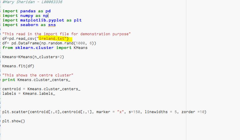
Appendix -Section 5 – Scikit-Learn – Demo File
5.4 Result of the comparing cluster:
Figures:
Figure 1-Health Ireland Survey 2015 -(Damian.Loscher,2015)
Figure 2- Simple steps to illustrate Big Data (Li,2015)
Figure 3- Process of Big Data (Gandomi and Haider,2015)
Figure 4-Diagram of functional requirements
Figure 5-Functional requirements
Figure 6-Diagram of Functional Requirements
Figure 7-Non- functional requirements
Figure 8-Diagram of non-functional requirements
Figure 10- Outlined of the project process
Figure 11-Overview of Data-flow diagram
Figure 12-Steps of Data-flow diagram
Figure 14- Outlined details of the Implementation stages
Figure 15- Download the Enthought Canopy
Figure 16-Create a new Twitter account.
Figure 17-Shows the create a twitter app
Figure 19- Overview of the file in notepad.
Figure 20- This shows the number of rows and columns
Figure 21-Importing the Food Balance file into Enthought Canopy.
Figure 22-Shows the result after the dataset was cleaned.
Figure 24-Create a Plotly account
Figure 25-Imported csv file in Enthought Canopy
Figure 26- Result of the Python scripts
Figure 27- Output of Ireland result
Figure 28-3D output of Ireland result
Figure 30-Comparing both countries
Figure 33- Functional requirement
Figure 34- Result of non-functional
Figure 35-Displaying the Apparatus
Figure 36-download the package tweepy into Enthought Canopy
Figure 37- first script to stream data
Figure 38- The file which contains the tweets
Figure 39- Output tweets in a notepad
Figure 40- This code spilt the tweet
Figure 41- The output of the split code
Figure 42- Scripts to produce the chart
Figure 43- Command for describe
Figure 45-Python script creating charts
Figure 46-Bootstrap Chart before clean
Figure 47- Box plot before clean
Figure 49- Scatter plot before clean
Figure 50- Line chart before clean
Figure 51- Command to get the max
Figure 57- Show the data types
Figure 58-Prints out the types result
Figure 60- Result of the deleted columns
Figure 62- Result of the figure 59
Figure 65- Alternation of the file
Figure 67- Number of rows and columns
Figure 69- Output the diabetes
Figure 70- File import to canopy
Figure 73- Box chart before clean
Figure 74- Chart to show diabetes
Figure 76- Print out the dataframe
Figure 78- Removes the columns
Figure 79- Result the of figure 76
Figure 80- The rows and columns
Figure 83- Show the false in the result
Figure 91- Chart of the general file
Figure 92- Example of Clustering
Figure 93- Result of Clustering
1. Project Proposal
Data Analytics – An exploration of techniques used in Data Analytics to produce analysed data in graphical format.
1. 1 Introduction
This project, will examine the techniques of Data Analytics used to cleanse, analyse, extract data and produce visual charts.
This project should demonstrate that Python language, can be used as a main element in the process of Data Analytics.
1.2 Background
Data Analytics, is the term given to the overall process, that collects, analysing, uses machine learning to developing algorithms which can produce predictable data via technology (Waller and Fawcett, 2013). Data Science has become an essential factor of the industry due to the massive impact of Internet. This is mainly due to the rapid advancements in technology and software, which allows people to gain a working knowledge of Data Science. However, Data Science requires the user to know what information they may need before the process begins.
This project, will achieve the process of Data Analytics, by obtaining datasets, streaming data, using Python scripts to cleanse and prepare the data to visually display the predicted results, in graphical form. This project will generate data on how sugar has become a major vocal point of discussion in our life’s. Data will be collected to demonstrate, how the amount of raw sugar imported to Ireland and the U.K has increased.
In recent times, the rise in sugar consumption has become a concern, since sugar is not only contained within fruit and vegetables, it is also added to various types of other foods such as cereals, processed foods, and drinks (Waller and Fawcett, 2013).
Increased sugar consumption can have an influence on body weight which can lead to such illnesses as heart disease, diabetes, metabolic syndrome, kidney disease (Johnson et al., 2007).
In Ireland, a proposed tax of 10% on SSB (sugar sweetened beverages) was addressed due to the rise in child-hood obesity in 2011 (Scarborough et al., 2013). This year in the budget it was confirm that in April 2018 the SSB tax will be added to all sugar products (Pope, 2016).
A report was produced in 2015 called “Healthy Ireland Survey 2015” and this report was based on comparing sugar intake to snack intake in Ireland between Men and Women aged between 15 to 65 years old. A graph from this report is illustrated in Fig 1, this graph does not clearly indicate sugar consumption (Damian. Loscher, 2015).
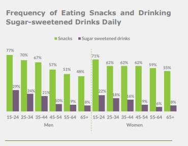
Figure 1-Health Ireland Survey 2015 -(Damian.Loscher,2015)
1.3 Aims
1. To obtain and examine knowledge on Data Science, in particular the area of Big Data and Data Analytics.
2. To investigate websites which have datasets and explore the various techniques to cleanse, extract and illustrate the data.
1.4 Objectives
2 To explore the various websites, evaluate and locate suitable datasets for this project and skills required for streaming data from large websites.
3. To examine various types of Tools and Technology that can be used in the process of Data Analytics.
4. To Investigate the different types of scripting languages that can be used in Data Analytics.
5. To examine and understand the working capabilities of Python and the packages that are available within Python.
1.5 Intellectual challenge
Overview: The author of this project, has no previous knowledge of Data Science, Big Data, and Data Analytics. The author hopes to obtain a working knowledge of the overall concept of Data Science and what are the elements that are contained within this area. The author also will examine and explore the terminology of Big Data and the relevant technology used in relation to Data Science. The author will investigate the process of Data Analytics and how the process involves obtaining data to illustrate the predicate result. The author will also develop the essential skills in using Python and produce scripts to extract the necessary requirements.
Why (this project):
The rise in employment in the Data Science sector and various companies requiring the skills of Analytics.
To confirm, Governments are concerned about the rise in sugar consumption and the adverse effect this is having on people’s lives. Previous research is mainly directed towards various types of food not particularly the intake of sugar.
1.6 Research Methods
Journals, academic papers, books, and various websites (kdnuggets etc.) will be the main source of existing research on Data Science. Data will be required on diabetes a sugar related disease to show the rise in this illness for people who range from the age of 20 to 79. Data will also be obtained by streaming and locating the relevant datasets. Python will be used to process the Data by means of extracting, cleansing, and clustering the Vital Data. Python and Plotly will be utilized to display the extract data in graphical form.
2. Scope
Extensive research will be out to obtain the relevant information to complete this project. This project will be completed by gaining an extensive working knowledge of the terminology of Data Science, Big Data, Data Analytics. Streaming and locating datasets, which will be imported into Enthought Canopy and python scripts will illustrated the results of the data in graphical form. For this project to succeed the location of the correct datasets is vital.
The datasets will be collected from the world datasets, U.K and Ireland government websites to examine the importing of raw sugar. Data will also be streamed from Twitter to examine how much people are talking about sugar. To Investigate sugar related diseases such as diabetes and the rise of the illness across the world.
2 .1 Big Data – To obtain an overall understanding of Data Science, mainly the area of Big Data and Data Analytics.
Investigate the main concepts of Data Science and in-depth the understanding of Big Data and Data Analytics. Research the technology and terms used within Data Analytics and Machine Learning and identifying the relationship between Big Data and Data Analytics.
2.2 Data -To explore the various websites, evaluate and locate suitable datasets for this project and skills acquired for streaming data from large websites.
Research various websites, journals, and white papers to find the location of suitable data sets. Read the various datasets to establish if the information is suitable regarding this project. Examine ways to streams data from Twitter. Investigate the file extension of the data sets to ensure that the datasets have not already been cleaned.
2.3 Technology – To examine various types of Tools and Technology that can be used in the process of Data Analytics.
Examine the various types of tools and technologies that could be used to clean, extract and display data from the datasets. For example, can the data be illustrated in excel. Consider all the tools and technologies, then evaluate which tools is to be used in this project.
2.4 Scripting Language – Investigate the different types of scripting languages that can be used in Data Analytics.
Research the different types of scripting languages which can be used in Data Analytics. Compare two programming languages to established which is going to be used in this project.
2.5 Python-To examine and understand the working capabilities of Python (Enthought Canopy).
Register for a course which has a guide tutorial on the Python (Enthought Canopy) these are available on Udemy at beginner’s level.
3.Plan
This outlines the time- frame given to each section of the project. The plan offers guidelines for the project but clearly indicates the deadlines that are required to complete the project.
3.1 First Term
| Task Name | Duration | Start | Finish | Weeks in total |
| Project Proposal | 21 days | Mon 19-09-16 | Fri 07-10-16 | 3 |
| Project Idea – research | 11 days | Mon 19-09-16 | Wed 12-10-16 | |
| Aims | 5 days | Mon 19-09-16 | Fri 23-09-16 | |
| Objectives | 5 days | Mon 19-09-16 | Fri 23-09-16 | |
| Project scope & plan | 14 days | Fri 07-10-16 | Fri 21-10-16 | 2 |
| Research scope | 4 days | Fri 07-10-16 | Wed 12-10-16 | |
| Outline plan | 10 days | Wed 12-10-16 | Fri 14-10-16 | |
| Literature Survey | 46 days | Mon 26-09-16 | Fri 11-11-16 | 7 |
| Research Data Analytics | 33 days | Mon 17-10-16 | Mon 07-11-16 | |
| Research python | 13 days | Tue 01-11-16 | Fri 11-11-16 | |
| Software Requirements | 21 days | Mon 31-10-16 | Mon 21-11-16 | 3 |
| Research software | 15 days | Mon 31-10-16 | Tue 15-11-16 | |
| Software Requirements | 6 days | Tue 15-11-16 | Mon 21-11-16 | |
| Design | 21 days | Mon 21-11-16 | Mon 05-12-16 | 3 |
| Design research | 14 days | Mon 21-11-16 | Mon 28-11-16 | |
| Design | 7 days | Mon 28-11-16 | Mon 05-12-16 | |
| Oral Presentation | 14 days | Mon 05-12-16 | Fri 16-12-16 | 2 |
| Presentation Research | 14 days | Mon 05-12-16 | Fri 16-12-16 |
Table 1- Table showing plan for first term
3.2 Second Term – Plan
| Task Name | Duration | Start | Finish | Weeks in total |
| Software Development | 39 days | Mon 23-01-17 | Fri 03-03-17 | 6 |
| Software Development – research | 24 days | Mon 23-01-17 | Wed 15-02-17 | |
| Learning Software | 7 days | Thu 16-02-17 | Thu 23-02-17 | |
| producing software | 6 days | Fri 24-02-17 | Fri 03-03-17 | |
| Interim Presentation | 11 days | Mon 06-03-17 | Fri 17-03-17 | 2 |
| Interim Presentation | 5 days | Mon 06-03-17 | Fri 10-03-17 | |
| Presentation | 6 days | Mon 13-03-17 | Fri 17-03-17 | |
| Draft final Report | 34 days | Mon 20-03-17 | Fri 21-04-17 | 5 |
| Draft report | 14 days | Mon 20-03-17 | Mon 03-04-17 | |
| Report | 17 days | Tue 04-04-17 | Fri 21-04-17 | |
| Final Report | 11 days | Mon 03-04-17 | Fri 14-04-17 | 2 |
| Create report | 11 days | Mon 03-04-17 | Fri 14-04-17 | |
| Oral Presentation | 11 days | Mon 17-04-17 | Fri 28-04-17 | 2 |
| Presentation preparation | 11 days | Mon 17-04-17 | Fri 28-04-17 |
Table 2- Table showing the plan for term 2
4 Literature Survey
4.1 Overview
Technology has become such a significant part of our daily lives with the rise in hand held devices which range from the phone to the tablet. All this technology means that information or data is available and people want to access this data as they need it. Imagine all the data or information, from all the sources around the world, floating about with no specific relevance. That data could be extremely relevant, for all various types of industries, if the data was extracted correctly and analysed, the data could be used as an essential marketing tool.
4.2 A brief history of Big Data
Questioning information or data, to obtain an answer has been going on for centuries. The ability to question data on a larger scale came around the 1960s, when computers started to appear on the market. The ability to compute data, opened doors for major companies, to obtain information or data on what customers want (Hurwitz et al., 2013).
In the 1970s the data model and the RDBMS created a structure for data accuracy, this meant that the data could be abstracted, cleaned, and queried to generate reports for various types of industry to research the extracted data. Over the last number of years, these methods have advanced, to what we know as Big Data. Data modelling has transported the way companies gather, extract, clean and use data as a major marketing tool to gain information on their customers’ requirements (Hurwitz et al., 2013).
4.3 Big Data
Around the late 1990s the term “Big Data”, was launched at the Silicon Graphics Inc although it did not become a massive buzz word until 2011 (Diebold, 2012).
Big Data can be defined as a term, used to described the huge datasets, which consist of both structured and non-structured data. These data sets can be very complex, however with techniques and various types of tools, this can enable the collecting, storage, cleansing, extract of the data to be analysed. The analysed data can offer great benefits to various types of industry (Sagiroglu and Sinanc, 2013).
There is a massive market for companies for all types of industries to know what people want. For example, the television company might what to know what types of programs people like to watch? This means the company could stream the data from a live feed such as Facebook or twitter. As the internet, has grown people are now communicating at a fast rate with large volumes of data being produced. Big Data consists of may attributes, which is known as three Vs – Volume, Variety, and Velocity (Russom, 2011).
These attributes can be described in detailed below in the table:
| Name | Description | |
| Volume | Volume in relation to Big Data means, the size of data which can range from terabytes to petabytes. A terabyte can store the same amount of data equal to the storage of 1500 CDS. The volume is the main attribute of Big Data because the size of the data sets can be massive (Gandomi and Haider, 2015). | |
| Variety | Variety is the structural context of the dataset. This means that the dataset can be constructed with various types of data, from structure to non-structured data. Structure data is a data, that is structured correctly and requires no cleansing methods. Non-structured data is data which may contain inconsistent, incorrect, or missing data within the datasets. Datasets can have both types of data. There are various types of software available to cleanse the data and this can amend any missing or inconsistent data within the datasets (Gandomi and Haider, 2015). | |
| Velocity | The speed or the frequency in which the data can be generated is the velocity. Collecting the Big Data is not necessarily done all the time in real-time, it can also be collected via streaming for example, streaming live feed in Twitter. Therefore, the data can be obtained as quickly as possible. (Gandomi and Haider, 2015). | |
Big Data
Big Data means that larger datasets(Volume) which consist of various types of data (Variety) can be collected at a fast pace (Velocity). There are also additional dimensions of Big Data which are Veracity, Variability and Value (Gandomi and Haider, 2015). In Fig 2, the illustration is of six simple steps to complete Big Data successfully (Gandomi and Haider, 2015).
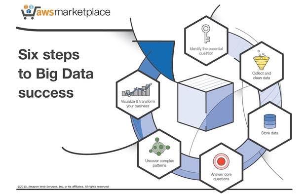
Figure 2- Simple steps to illustrate Big Data (Li,2015)
The term Big Data refers to the data, the type, size and rate however the data has no relevance until the data goes through a process called Data Analytics.
4.4 Data Analytics
Analytics is using tools and techniques, to analyse the data and extract any relevant data from the datasets and streaming data. Data Analytics is a term which is used to describe the techniques used to examine and transform the data from datasets and streaming data into relevant information which can be used to predict certain future trends.
The data can be used to produce reports from querying the data, it offers a prediction or interpretation of the data. For example, a dataset is located, on most popular cars bought over the last five years. When the dataset is checked for inconsistencies like missing data or incorrect data and then the data is cleaned. The cleaned data can be displayed in a bar chart or graph to visual the cars display bought over the last five years. Basically, Data Analytics turns the cleansed data into actionable data or information (Hilborn and Leo, 2013). There are various types of analytics, text analytics, audio analytics (LVCSR systems and phonetic-based systems), video analytics, social media analytics, social influence analysis and predictive analytics (Gandomi and Haider, 2015).
4.4 a Machine Learning:
Machine learning is the element of Data Science, that computes the algorithms effectively to construct the data models (Mitchell, 2002). Machine learning is an artificial intelligence that allows the computer to compute, by not having to be explicitly programmed. Machine learning allows the development of programs that can expanded and change when the new data is added. Machine learning has the intelligence to predict the patterns in the data and alter the program accordingly (Meng et al., 2016).
Machine learning algorithms are categorized into three different types which is supervised, non- supervised and semi-supervised.
Supervised can be described as the input and output variables which use algorithms to be mapped from the input to output accordingly. Supervised can be sub–divided into two sections: classification and regression. Unsupervised algorithms have an input variable with no corresponding output variables and can be also sub-divided into two categories: clustering and association. Semi-supervised is where data is considered to between the supervised and non-supervised (Brownlee, 2016). This project, will use the supervised machine learning algorithms along with unsupervised such as clustering.
4.5 Data terms used in Data Analytics
1. Data Mining
Knowledge discovery in databases (KDD) is another name given to data mining. Data mining is a more in-depth method of analyzing data from different dimensions (Ryan S J D Baker, 2010).
2. Data Cleansing
Data cleansing is a term given to the cleaning of data within datasets or huge amounts of data. When data is, collect or recorded, there is always an area of error or inconsistency with massive amounts of data. To cleanse the data, each data entry must be checked for missing or incorrect data entries. This can take a long time to achieve but there are software programs available to speed up the process of cleaning the data (Maletic and Marcus, 2000).
3. Clustering/Cluster analysis
This method involves gathering data of the same cluster/group together into one cluster. Basically, it is the grouping of a cluster of a similar task into a group. The groups or cluster are observed as a cluster and analysed as a cluster (Ketchen and Shook, 1996).
4.6 Relationship between Big Data and Data Analytics
All relationship has a bond, the data is the connecting bond between Big Data and Data Analytics. Although Data Analytics would not be possible without Big Data, as Big Data is the first stage in the process of Data Science. Big Data, or more importantly the data sets are not relevant until the data is processed or analysed. The analytics side of the relationship turns the data into useful or important data that can predicate future trends. With the correct techniques and tools this relationship can produce extremely productive information.
In Fig 3 is illustration of the process between Big Data and Data Analytics (Gandomi and Haider, 2015).
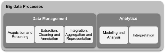
Figure 3- Process of Big Data (Gandomi and Haider,2015)
4.7 Datasets – Overview
Datasets are sets of data which consist of both structured and non-structured data. Several Government Departments, Public Administration or live feeds from Twitter can create these datasets (Ermilov et al., 2013).
4.7.1 Datasets – File Extensive
The data display in datasets is displayed in tabular form and is saved as CSV file or Excel extension. Although datasets saved in excel are normally cleansed data and are ready to display the result in visual format. CSV files can store extremely larger amount of data and the data must be cleansed before analysing. (Ermilov et al., 2013).
4.7.2 Datasets
Two methods will collect the data sets
1. Streaming data from a Twitter.
2.Collecting datasets from Global datasets, U.K and the Ireland.
4.8 Techniques use in Data Analytics/Data Science
Big Data and Data Analytics are elements of Data Science. To implement these elements, the assumption that an extensive knowledge of programming a language acted as a deterrent for people to understand the process. Data Science requires a considerable number of algorithms to produce the visual output of predictable information (Witten and Frank, 2005).
Thus, a lot of companies have invested a vast amount of time and money to produce software platforms where people can obtain knowledge of the Data Science by following simple steps. These software package have easy to follow GUI interface for the user to gain knowledge of Data Science with ease and confidence (Witten and Frank, 2005).
Below is a brief outline of some software packages that can help people to develop Big Data skills with little or no coding skills.
Table 3- Packages for Data Analytics
4.9.1 Programming Languages used in Data Analytics
Programming languages are a vital part of Data Science and the process of Data Analytics. Data Analytics uses tools to analysis the data and the programming language have the ability to reproduce data in visual view. For example, in Python the libraries can produce charts line charts etc. Over the last number of years there has been a major debate over which programming languages produces the best result through Data Analytics (The Data Camp Team, 2015). Below is an overview of the two most popular programming languages R and Python.
4.9.2 R – Programming Language:
Around 1995 a new programming language called R was released and soon became a very popular tool for Data Science. R is an open source software and has a platform for implementing data algorithms in Data Analytics. R programming language is one of the top software or techniques for analysing and displaying the data result. R has significant benefits to the user by allowing code closures through lexical scoping, this also allows R to support for arithmetic’s, which includes with missing data. R can be easily learned through various tutorial and is aimed for people wanted to analysis data. (Hosking, 2012)
4.9.3 Python – Programming Language:
In the early 1990s, Python was designed as interactive object oriented language. Python contains list with high data-structures, dictionaries, and Libraries. It is also an open source and can run on several computer operating systems. Python is suitable for creating web base analysing data and can be integrated into an app with great ease. Python is suitable for a beginning programmer with it’s easy to follow interface (SANNER, 1999).
4.9.4 Comparing the Languages:
After reviewing both languages – python is more favorable to the requirements of this projects. Python is a language which is easy to understand and is more suitable due, to level of experience of the Author. Python has some good interactive libraries such as Numpy, Pandas, Matplotib which is used in Data Analytics. (Joseji, 2014).
Python libraries:
Numpy – Datasets can be very large and complex, an in-Data Analytics analysing the data calculation can be required. Numpy can calculate, data over an entire array and it is used to import python using the command import Numpy as.np (McKinney, 2012).
Pandas- Is uses in Data Analytics, Data Manipulation, to produce visual formed data into graphs. It is of high performance and can manipulate data from csv files and output the data as sql file. It is built on top of Numpy and can produce various graphs like line, bar and can work well with the incorporation of Matplotib (McKinney, 2012).
Matplotib -Is a library used in Python and it is an extension of Numpy. It provides API for embedding plots into applications to create graphs like Scatter plot, Histogram Line plot and 3D plot (McKinney, 2012).
IDE text editor – In this Project python, will be learned by using IDE –for text editor to learn the basic of python (McKinney, 2012).
Enthought Canopy – In this Project the datasets scripts will be scripted in Enthought Canopy. This is an online interactive environment for creating Python scripts (Macmillan pulisherlimited,2014).
Conclusion:From the extensive research on the principles relating to Data Science. An overall conclusion points in the direction of extremely predication capabilities of this technology can provide a wide range of companies. The potential to obtain the data which can predicate, illustrate what future outcomes can be explored from analysing data. Explore the increase of raw sugar which is imported to both countries. To examine the rise in sugar related disease such a diabetes. This project will be achieved by streaming data and locating datasets to obtain the information. Python will be utilized to cleanse, analyse and produce the best visual models from the extracted data.
5. Software Requirements
5.1 Overview of the project software requirements
The project, must establish the software requirements which is relevant to the needs of the project. The software requirements will give an in-depth description which list the functionality and nonfunctional requirements. These requirements will illustrate the user’s expectations from the project. The functional requirements can be obvious e.g. what is the purpose of the project. The nonfunctional requirements may not be so obvious e.g. the security of the project (tutorials point, 2016).
The purpose of this project is to visualise the display data, by using the techniques of Data Science, to demonstration the consumed of sugar and the impact that this can have on people’s lives. Fig 4 clearly illustrates the way the requirements are listed in accordance to their priority.
Please note that the Priorities columns is measure is the follow way:
Priority – Level 1 – Requirements that will definitely be in the project.
Priority – Level 2 – Requirements that might be on the project.
Priority – Level 3 – Additional Requirements that could to be on the project.
Priorities diagram: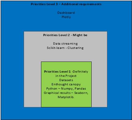
Figure 4-Diagram of functional requirements
5.1 Functional Requirements
Listed in Figure 5 is a table displaying all the Functional requirements of this project and their level of priority.
| Functional Number | Functional Name | Functional Description | Priority | Test
(P =pass F =fail) |
| FR001 | Collect Data | Locate suitable data for the project | 1 | P |
| FR001.1 | Streaming data | Streaming data from a Twitter. | 2 | P |
| FR001.2 | Datasets | Find suitable datasets | 1 | P |
| FR002 | Check the datasets | Will process the Data before analysing. | 1 | P |
| FR002.1 | CSV files extensions. | CSV Datasets must be cleansed | 1 | P |
| FR002.2 | XLS files extensions. | XLS files must be cleansed. | 1 | F |
| FR002.3 | Duplication of data | Removal of all duplication of data. | 1 | NA |
| FR003 | Transport data | Transport the data from Twitter by using a python script through Enthought canopy. | 1 | P |
| FR003.1 | Import data | Import the streamed data into a csv file. | 1 | P |
| FR003.2 | Remove the timestamp and tweet only. | A Python script will be written to remove the timestamp and tweet only (in Enthought canopy) . | 1 | P |
| FR003.3 | Create a chart | Use a Python script to count the tweets (Enthought canopy). | 1 | P |
| FR004 | Data stored | All scripts will be saved into separate folder in accordance to the data. | 1 | P |
| FR004.1 | Python scripts | Scripts will be saved as a python extension. | 1 | P |
| FR005 | Analyse Data | Extracting of data. | 1 | |
| FR005.1 | Query the data | Questions written to obtain the extract data. This will be achieved by scripting the scripts to extract the relevant data. | 1 | P |
| FR005.2 | Scripts | Each python script will be constructed according to the query. | 1 | P |
| FR006 | Python | Various Libraries are available on Python. | 1 | P |
| FR006.1 | Numpy | To create a range of numbers or any numeric operation Numpy will be imported. | 1 | P |
| FR006.2 | Matplotib | For graphical outputs Matplotib will be imported | 1 | P |
| FR006 | Pandas | Pandas will be imported to cleanse, prepare and to create graphs. | 1 | P |
| FR007 | Visual Display | Data illustrated in graphical forms. | 1 | P |
| FR007.1 | Seaborn | Will be imported along with Matplotib to illustrate the graphical results. | 1 | P |
| FR007.2 | Bootstrap – Pandas | Will be used to demonstrate charts and graphs. | 1 | P |
| FR008 | Additional Resource | These are components which offer additional input to the project. | 3 | P |
| FR008.1 | Plotty | Visualization of the result | 3 | P |
| FR008.2 | Dashboard | Various format of displaying the result. | 3 | F |
| FR008.3 | Scikit-learn | Creates clusters like Scatter plot, Histogram Line plot. Available in the Appendix section 5. | 2 | P |
Figure 5-Functional requirements
5.2 Functional Requirements Diagram:
In Figure 6 illustrates the process of the data in accordance’s to the Functional Requirements.
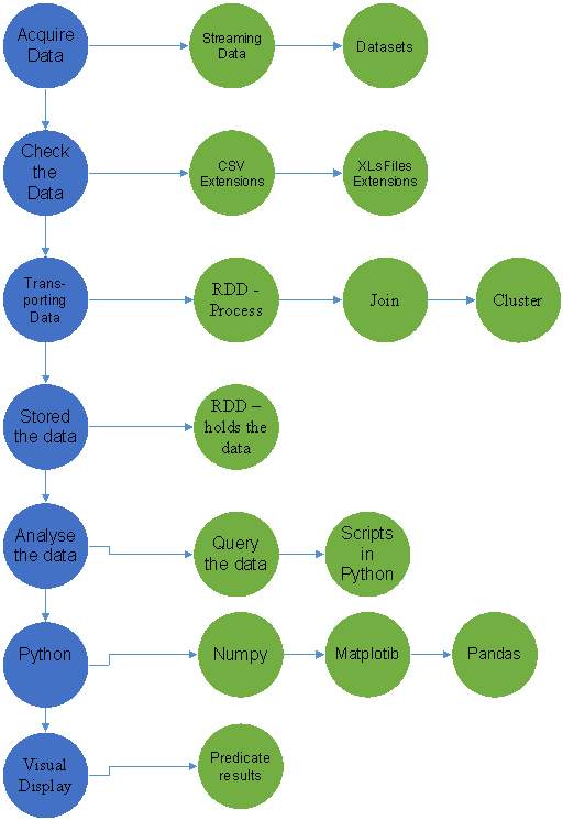
Figure 6-Diagram of Functional Requirements
5.2 Non – Functional Requirements
Listed in Figure 7 is a table displaying all the non-functional requirement.
| Functional Number | Functional Name | Functional Description | Priority | Test
(P or F |
| NFR001 | Accessibility | Access to the required techniques, to complete the project. | 1 | P |
| NFR002 | Security | Streaming and datasets must be stored in a securely for no alternative can be done to the data. | 1 | P |
| NFR003 | Reliable | The source of datasets must be obtained from reliable techniques (stream data) and websites. | 1 | P |
| NFR004 | Efficiency | The techniques used must be efficient. | 1 | P |
| NFR005 |
Capacity |
The techniques can handle the datasets capacity. | 1 | P |
| NFR006 | Performance | The techniques have the capabilities of perform all the required task for Data Analytics project. | 1 | P |
| NFR007 | Time | Record the amount of time for streaming data. | 3 | F |
Figure 7-Non- functional requirements
5.3 Non – Functional Requirements
In Figure 8 illustrates the process of the data by using the non-functional requirements
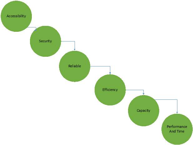
Figure 8-Diagram of non-functional requirements
6.0 Design
This is an outline design of this project and considers all aspects of the projects elements. In order to design the project a guide of the following steps must be drawn up. In Fig 9 an outline of the steps required are detailed.
Steps involved in the project:
|
||||||||||||||||||||||||||||||||||||||||||||||||||
- Data will be streamed from Twitter.
- Both datasets and streaming will be imported into Enthought Canopy were it python scripts will be wrote to clean and prepare the data.
- Scripts will be scripted in python using the following libraries Matplotib, Numpy and Pandas.
- The Data will then be displayed in visual graphical format to illustrate the findings of questions.
6.2 Overview of Data flow diagram:
In Figure 11 outlines the Data flow and points are listed below to explain the data flow.
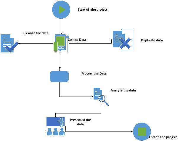
Figure 11-Overview of Data-flow diagram
- Start – This is the start of the project.
- Collect data – The Data is collected from both datasets and streaming.
- Cleanse the data – The data is cleansed.
- Duplicate data – All duplicated data is removed.
- Process the data – The data will be imported into Enthought Canopy.
- Analyses the data – The data will be analysed to extract the relevant information.
- Presented the data – The represented of the data will be achieved in graphical form.
- End – The Data Analytic project is now complete.
Figure 12 outlines some in-depth steps of the data flow of this project are given from A to J.
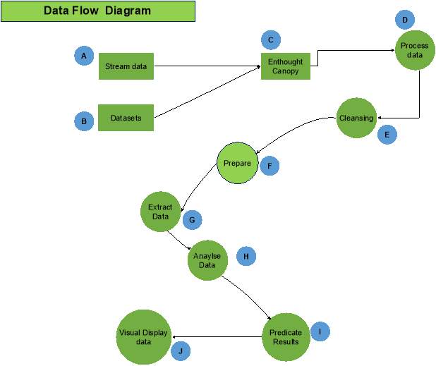
Figure 12-Steps of Data-flow diagram
A. Stream Data – Streaming data from Twitter.
B. Datasets – Located datasets on raw sugar imported in Ireland and U.K.
C. Enthought Canopy – Imported the data.
D. Process Data – By importing the dataset into canopy and constructing python scripts.
E. Cleansing Data – Removes all the errors and duplicated data.
F. Prepare Data – Ensure that Data is valid and ready for extraction.
G. Extract Data – Extract the necessary data only.
H. Analyse Data – Ensure that is the correct data needed.
I. Predicate Data – Numpy will be imported to python to calculate the predicate results.
J. Visual Displaying the result – Matplotib and Pandas will be scripts in python to display the data.
6.4 Use – Case Diagram:
Figure 13 is illustrating the use-case diagram and this interprets the user interaction with the project.
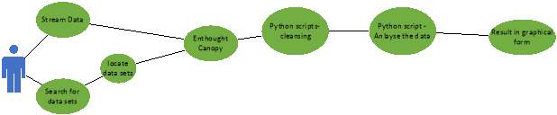
- The user – will streaming and search for dataset.
- Once the data is Located data
- The user will- imported the data into Enthought canopy were a script will be produce to cleanse and remove any errors from the dataset.
- The user will -then analyses the data by extracting the required information.
- The user will – Python scripts will import Seaborn, Pandas and Matplotib.
- The user will- then display all the results in graphical form.
6.4.1 Conclusion:
The main approach of this project is gain the relevant skills required to locate data, imported the data into Enthought Canopy, query it (extract the data) and displays the results in graphical form(Python). An alternative flow of the project is available in the appendix. Over the next month, a number of relevant courses need to be completed on Udemy in order to obtain a full understand of the skills required to complete this project.
First an introduction to Python needs to be completed. Second an introduction to Enthought Canopy will be completed.
Thirdly a course with combines the knowledge on both Python and Enthought Canopy will be obtain and the skills required learnt. A full timetable of studies being conducted over the Hoilday period is available on section 10.
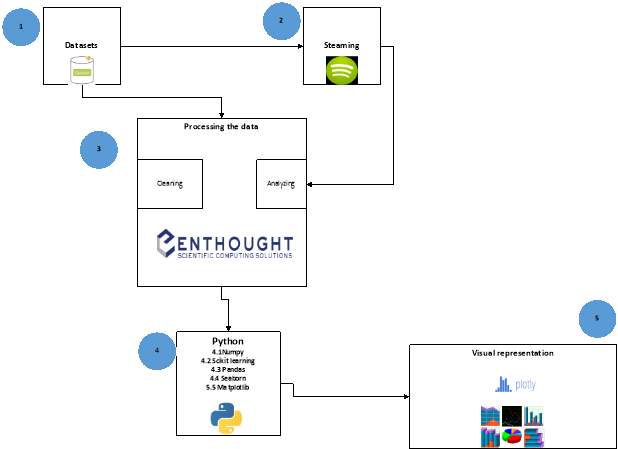
7.0 Implementation
Introduction
After the design of the project was outlined and the necessary courses were completed over the holiday period, it was necessary to revise the proposal of the project and remove the implementation of Apache Spark. The reason for the alternation, was in order to demonstrate Spark’s full capacity the process requires datasets above 1 TB. However, the author did not have the necessary equipment to process these requirements and after a discussion with the project supervisor the original document was altered.
The next stage of this project was to implement the objectives (ref 1.4) and this was accomplished by following the five steps (in Figure 14) listed below:
| Step | Requirements | Details |
| 7.1 | Software | Enthought Canopy was downloaded and the
Python packages used were the following:
|
| 7.2 | Data | A. Stream – sugar tweets from Twitter.
B. Locate datasets 7.2.B.1. Food balance 7.2.B.2. Diabetes prevalence Scikit-Learn – Demo File – Appendix section 5. |
| 7.3 | Cleaned and prepared the data. | Python scripts were composed and implemented in accordance to the requirements. |
| 7.4 | Analysed and extracted the data. | Python scripts were created to analyse and extract the data. |
| 7.5 | Visualization of the results | Package used to construct the graphical results.
A. Pandas B. Seaborn C. Plotly D. Matplotib |
Figure 14- Outlined details of the Implementation stages
7.1. Software Requirements:
As outlined in the proposal, python was used as the programming language to produce the necessary scripts to implement the objectives. Enthought Canopy was chosen as the python IDE (Integrated Development Environments) and was downloaded by implementing the following steps:
- Logged on to the web browser and located Enthought Canopy website and clicked on downloads at https://store.enthought.com/downloads/#default
- Selected download, for win [64-bit], version 1.7.4 and keyed in the necessary details then clicked save.
- The installation steps that were followed to install Enthought Canopy (ref appendix Figure 15) software.
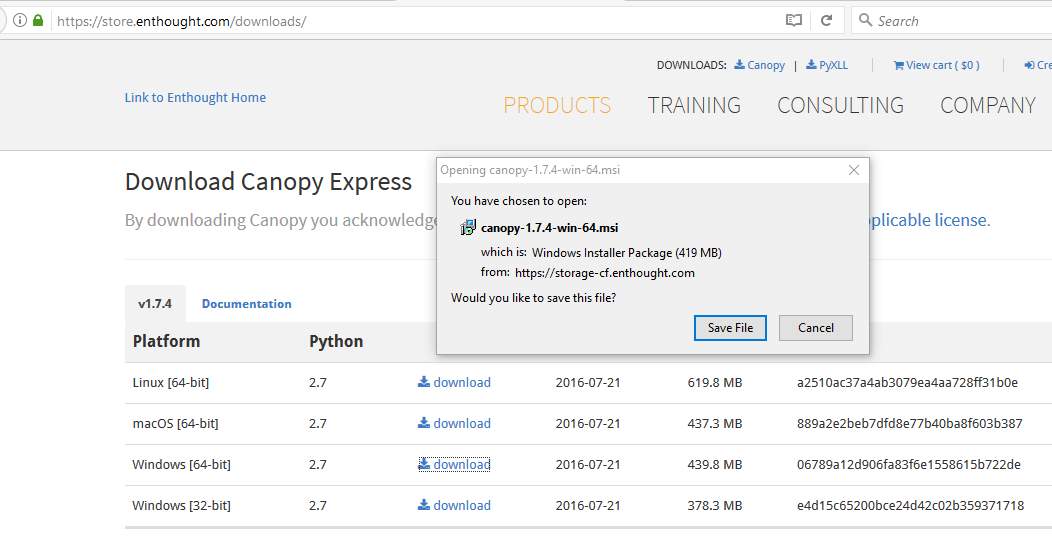
Figure 15- Download the Enthought Canopy
- A shortcut icon was created on the desktop.
7.2.A Data – Streaming the data:
7.2 A Purpose – The main reason for streaming tweets from Twitter was to see how much people are discussing sugar. To produce a chart to count how many times Twitter accounts tweet about sugar and the results will be available in section 8.1A
Stages are listed below on how a dataset on sugar tweets was generated:
Twitter account
- A Twitter account was created by logging on to the following link
https://twitter.com and filled in the relevant information.
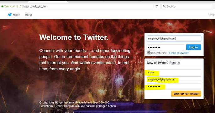
Figure 16-Create a new Twitter account.
- Figure 16 shows the Twitter account created and the log in details being implemented.
- Once the Twitter account was created and Twitter app was required.
Twitter App
- Typed in the following web address – https://apps.twitter.com.
- The Twitter details were entered and clicked on creating an app.
- Filled in the necessary details to create a new app.
- Copied the URL of the twitter account into the URL field.
- Clicked on terms agreed and in Figure17 shows that the app has been created.

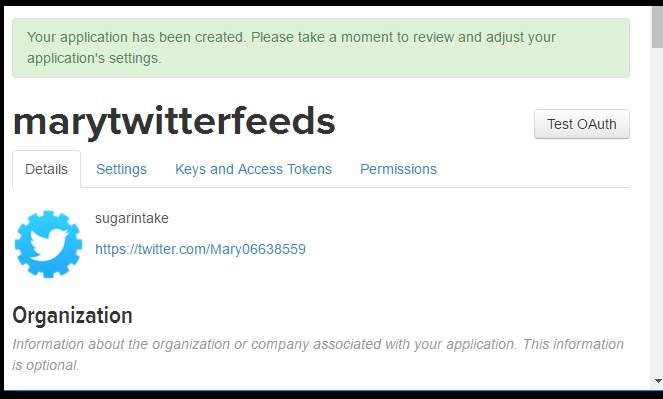
Click on the third divider.
Figure 17-Shows the create a twitter app
- The Keys and Access tokens were generated by clicking on the third divider.
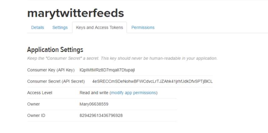
- Figure 18 shows the Twitter app was set up with the access tokens and necessary keys generated.
Installing Tweepy
- Before the tweets can be streamed a package called Tweepy was installed on Enthought Canopy.
- Installed tweepy- by selecting the on- project manager menu tab in Enthought Canopy
- Typed in the word Tweepy into the search bar.
- Then pressed install the latest version (screen shot available in appendix section 1).
Creating Python scripts
- Clicked on the new tab in Enthought Canopy to create a new script and typed in the relevant code to stream the data which is illustrated in appendix section 2 A.
- The python script was written by following and adapting a YouTube video on https://www.youtube.com/watch?v=d-Et9uD463.
- The output file and the results are in the appendix section 2 B &C.
- The script was appended by following the listed tutorial to remove the tweets only http://adilmoujahid.com/posts/2014/07/twitter-analytics/.
- After the script was altered the output was printed and the screenshots are in the appendix section 2 D & E.
- A chart was created to demonstrate the number of tweets (the script used is in section 2 F).
The results of the streamed tweets are available in 8.0 Result sections in Figure 26 and the results will be discussed in the 9.1.A Evaluation – Streaming the data.
7.2.B Data – 1 Food balance:
7.2.B Purpose –The main reason for locating the first dataset is to find the amount of raw sugar imported to Ireland and the U.K. To observe if there is any increase of raw sugar imported to Ireland and the U.K from the year 2008 to 2013.
A dataset was found on the following website http://www.fao.org/faostat/en/#data/FBS.
Description
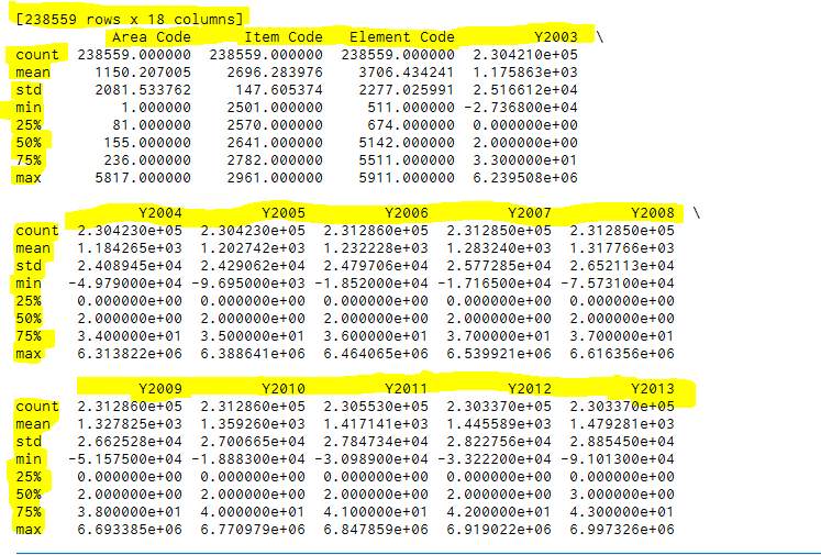
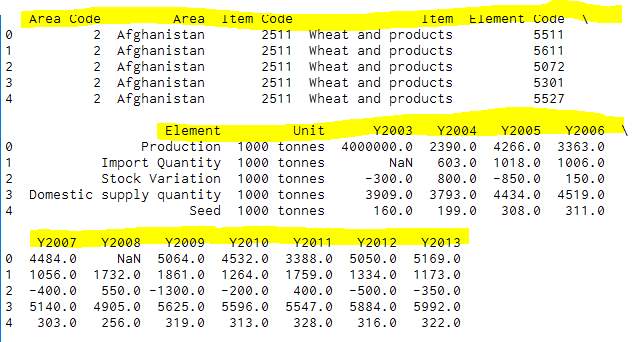
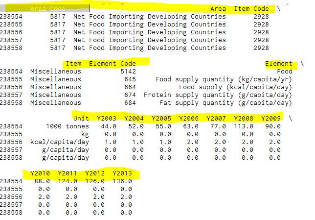
Food Balance Sheet is a dataset which shows various types of foods that are imported to different countries across the globe. This specific dataset was selected from the year 2003 to 2013 and an overview of the file is illustrated in Figure 19 (Fao.org, 2017). This dataset had 238,559 records and 18 columns in Figure 20.
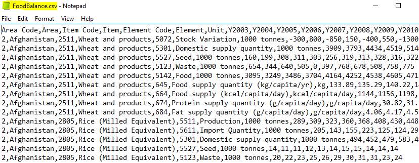
Figure 19- Overview of the file in notepad.
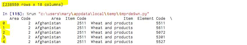
Figure 20- This shows the number of rows and columns
7.3.1 Cleaning the preparing the Food Balance Dataset:
This dataset was imported into Enthought Canopy were a series of steps where applied to clean and prepare the data.#Please note that all the code has being adapted in accordance to the course on Python for Data Science and Machine Learning Bootcamp (Udemy, 2017) and using tutorial on Stackoverflow (Stackoverflow.com, 2017) #.
Importing the datasets – Food Balance
- Clicked on the Enthought Canopy icon.
- A new script was opened.
- The pandas package was used to import Foodbalance.csv file.
- The file was saved into a dataframe called “df” and this is showed in Figure 21
- To find out exactly what the contents of csv file had a command describe was applied and the screenshots are available in the appendix section 3 A.
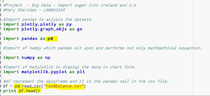
Figure 21-Importing the Food Balance file into Enthought Canopy.
Cleaning and preparing – Food Balance
Before the dataset was cleaned a series of charts were produced to see what data was stored in the foodbalance.csv file. Producing a number of charts is considered good practice as it gives a clear picture of what data is required for extraction. The script used and charts are available in the appendix section 3 B + 1B.
After careful observation of the description from FoodBalance.csv it was the author’s decision to remove and rename certain columns from the file by following the steps below:
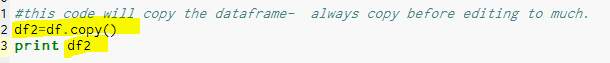
Copy of Dataframe – Reason- to ensure that the original dataframe was not altered.
A copy of the original dataframe was created by typing the following:
code – df2=df.copy ().
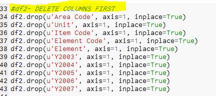
- Remove the columns – Reason – As the author only required the columns Code, Country, Product, and the years from 2008 to 2013
The code below was used to remove the other columns:
df2.drop(u’Item Code’, axis=1, inplace=True)
df2.drop(u’Element Code’, axis=1, inplace=True)
df2.drop(u’Element’, axis=1, inplace=True)
df2.drop(u’Y2003′, axis=1, inplace=True)
df2.drop(u’Y2004′, axis=1, inplace=True)
df2.drop(u’Y2005′, axis=1, inplace=True)
df2.drop(u’Y2006′, axis=1, inplace=True)
df2.drop(u’Y2007′, axis=1, inplace=True)
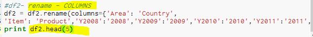
- Rename the columns –Reason – to make the dataset clearer to understand.
The code below was used:
df2 = df2.rename(columns= {‘Area Code’: ‘Code’, ‘Area’: ‘Country’,
‘Item’: ‘Product’,’Y2008′:’2008′,’Y2009′:’2009′,’Y2010′:’2010′,’Y2011′:’2011′,’Y2012′:’2012′,’Y2013′:’2013′}).
Result- shows the columns are renamed.
- Find any errors – the columns –Reason – to check the data for errors
The code below was used:
pd.isnull (df2)
Result- display true if there is no value and false if the cell has a value.
- To remove data –Reason – to remove the na values is vital to give accurate results.
The code below was used:
df2.dropna()
Result- removed all na values from the dataframe.
The file was save as Ireland.py all the code and the results are available in the appendix section 3 C.
7.4.1 – Food Balance dataset – Analysing and Extracting of the Data:
After all the errors were removed there was only 229,492 rows left which is displayed in Figure 22.
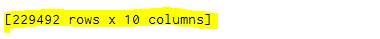
Figure 22-Shows the result after the dataset was cleaned.
In order to extract the raw sugar on Ireland the reminder of the dataframe had to be analyzed by looking for the relevant file which was located in row 85636:85637.
Extracting the data
- To extract the row 85636:835637 the df2 dataframe was copied.
- The new dataframe was called dfIre.
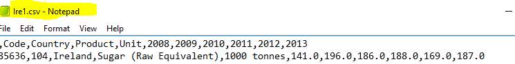
- The following code was applied – print dfIre [85636:85637].to csv (‘Ire1.csv’).
- And the dataframe was saved into the Ire1.csv the screenshot is available in section 3 C.
Extracted data
- Opened the Ire.csv and the recording is longitude and not vertical as showed in Figure23.
- A new script called clenuptran.py was composed to transpose the longitude file into a separate file the code below was applied:
#df represent the dataframe and it is the pandas call in the csv file.
df = pd.read_csv(‘Ire1.csv’)
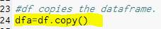
#df copied into dfa csv file.
dfa=df.copy()
#print the dfa dataframe
print dfa
#df transpose the df frame so rows can be deleted
print df.T.to_csv(‘Irett.csv’)
- The record is transposed.
7.5.1- Food Balance dataset -Visualization of the results
Ireland – Matplotib
- In order to produce a line chart to separate python script was composed called Ireland chart only.py.
- Matplotib was imported into the script.
- And the Irett.csv file was loaded.
- X, Y axes was selected.
- The titles were typed in for ylabel and xlabel.
- Plot show was used to display the line chart.
The output result is available in section 8.1.B.1 + 2 in Figure 27 & 28.
U.K – Matplotib
- The same process was implemented to locate the U.K raw sugar import.
- The python scripts called uk.py was composed to clean and extract the file 178207:178208.
- To transpose the file a separate called cleanuk.py.
- A line chart was created using Matplotib called ukchart.py.
The output result is available in section 8.1.B.3 in Figure 29.
Plotly
- A plot was created by typing in Plotly into google and clicking on the below link
- A plot account was created by filling in the necessary credentials which is showed in Figure 24.
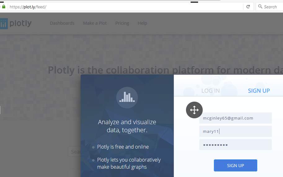
Figure 24-Create a Plotly account
- The new account has limited access because it was a free account (Plot.ly, 2017).
Comparing U.K to Ireland
- In order to create a chart to compare both countries a new script was composed called both.py. This script followed the tutorial on this link http://pandas.pydata.org/pandas-docs/stable/merging.html (Pandas.pydata.org, 2017).
- This script imported both csv files and the data frames were joined together.
- The results of the joined were copied in to a notepad file for alternations.
- The file was then imported up to plot.ly were the interactive line chart was created (Plot.ly, 2017).
The output result is available in section 8.1.B.4 in Figure 30
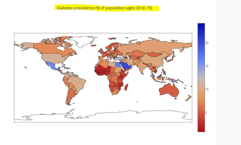
7.2.B Data – 2. Diabetes prevalence (% of population ages 20 to 79):
7.2.B Purpose – The objective for locating this dataset was to see the percentage of people aged between 20 to 79 who have diabetes in different countries. http://data.worldbank.org/indicator/SH.STA.DIAB.ZS.
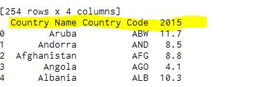
Description -2. Diabetes prevalence
This dataset contained information on the rise of diabetes from countries all over the world (Data.worldbank.org, 2017). The dataset was called API_SH.STA.DIAB.ZS_DS2_en_csv_v2.csv and renamed before.csv.
7.3. 2 Importing the datasets – Diabetes prevalence
This dataset had an error when it was downloaded and imported into Enthought Canopy. This meant that the dataset was downloaded again and had to be cleansed by using Enthought Canopy free trial called import tool but the trial only lasted for a week and all alternations were recorded.#Please note that all the code was generated by following the course on Python for Data Science and Machine Learning Bootcamp (Udemy, 2017) and using adapting code in accordance with Plotly (Plot.ly, 2017). #
Cleaning and preparing – Diabetes prevalence
- Once the dataset is through the import tool it was then uploaded into Enthought Canopy as the before1.csv.
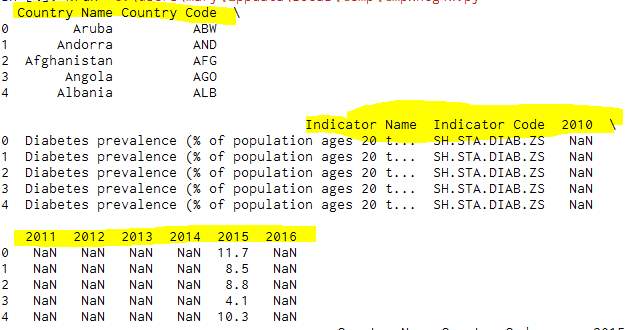
Figure 25-Imported csv file in Enthought Canopy
- A python scripts called correctclean.py was composed.
- All the unnecessary columns were removed by applying the following commands
- Remove the columns:
del dfa [‘2010’]
- Rename the columns:
dfa. rename (columns={‘2015′: u’Year’}, inplace=True)
- To remove errors – Fill missing values in Year with “0”:
dfa[u’Year’]. fillna(value=0, inplace=True, downcast=’infer’)
- Delete rows where Year ==0:
dfa.drop(dfa[dfa[u’Year’] ==0].index, inplace=True)
- Save to a csv file:
print dfa.to_csv(‘Clean.csv’)
All code that was composed in the python script called correctclean.py are in appendix section 4.
7.4. 2 Diabetes prevalence
Extracting the data
- Once all the errors were removed a new python script was composed to outline a choropleth map which was created in Plotly.
- This script was called chorol174.py.
- The script was composed by following the tutorial on Udemy (Udemy, 2017) and observation of previous choropleth map is available on plot.ly (Plot.ly, 2017).
The output result is available in section 8.1.B.5 + 6 in Figure 31 & 32.
8.0 Result sections:
In the result section shows the graphical output of the scripts that were composed for the various dataset.
8.1.A Data – Streaming the data:
In Figure 36 a python script was produced to extract and count how many tweets were wrote on twitter containing the word sugar.
The result of the scripts were illrustated in the bar chart below:
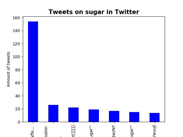
Figure 26- Result of the Python scripts
8.1.B.1 Data – Food balance – Ireland output – A
This is the result of the food balance in relation to the raw sugar imported to Ireland.
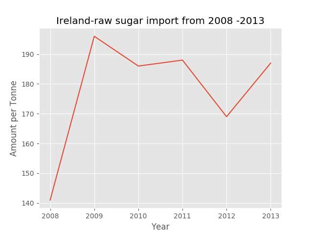
Figure 27- Output of Ireland result
8.1.B.2- 3D plot
A 3D plot was created using the Matplotib and the YouTube tutorial. (youtube.com/user/sentdex, 2017).
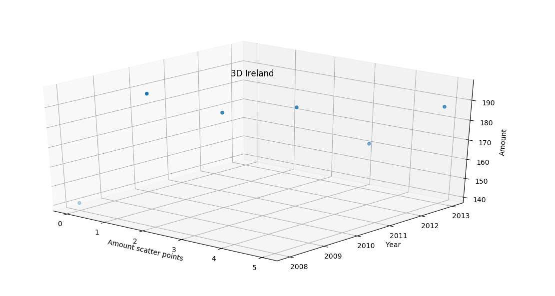
Figure 28-3D output of Ireland result
8.1.B.3 Data – Food balance – U.K output
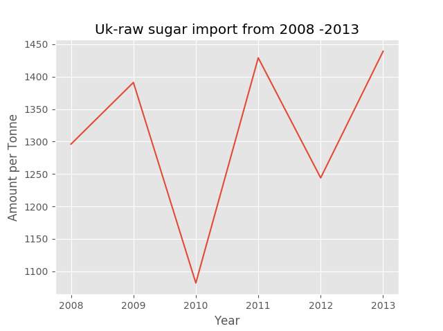
This is output results of the food balance in relation to the raw sugar imported to U.K.
8.1.B.4 Data – Food balance – Comparing U.K and Ireland
This is result of comparing both countries raw sugar imported.
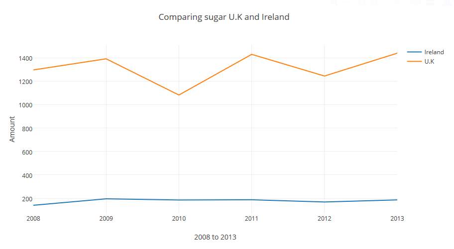
Figure 30-Comparing both countries
8.1.B.5 Diabetes for population ages 20 to 79
This output result is of the Diabetes dataset.
8.1.B.6 Ire and U.K
This shows the results for Ireland and the U.K only (this was done by zooming into the two countries)
4.7 /U.K


4.4/Ire
An outlined evaluation of each graph and the projected resulted is section 9.
8.2 Testing Result
This section will outline whether all the requirements were complete and review any future alternations to them. In Figure 35, clearly indicates the testing of the apparatus used in this project.
Functional requirements:
In Figure 5 & Figure 7 the functional and non-functional requirements were established and was fill in with the correct result after the project was completed. An overview of the requirements which were not complete is outlined in Figure 33 and Figure 34.
| Functional Number | Functional Name | Functional Description | Priority | Test
(P =pass F =fail) |
| FR002.2 | XLS files extensions. | XLS files must be cleansed. | 1 | F |
| FR002.3 | Duplication of data | Removal of all duplication of data. | 1 | NA |
| FR008.2 | Dashboard | Various formats of displaying the result. | 3 | F |
Figure 33- Functional requirement
Non-Functional
| Functional Number | Functional Name | Functional Description | Priority | Test
(P or F |
| NFR007 | Time | Record the amount of time for streaming data. | 3 | F |
Figure 34– Result of non-functional
An evaluation of functional and non-functional requirement which were completed is in section 9.
8.2.A Testing of apparatus:
Although the requirements both functional and non-functional were reviewed and evaluated in relation to the project. The equipment, software and the python packages must also be evaluated in relation to their capabilities within the project requirements.
| Apparatus used | Evaluation | Recommend | Future Alternations |
| Equipment
Author’s Laptop |
Portable and convenient for installing the necessary software and package | Yes | Spark project in the future.
It would not have enough storage or processor capacity for this type of project. |
| LYIT equipment | Not portable but excellent internet connectivity for downloading datasets. | Yes | The author would use this equipment for other projects. |
| Software
Enthought Canopy Tweepy |
Enthought Canopy caused difficulties at times. One example was deleting many rows it took hours and it would not recognize a range of numbers. The author believes that if a licensed package was subscribed then those difficulties may not have occurred.
Tweepy was installed in canopy to stream the data from Twitter. There were no problems with this package. |
Yes – the licensed package.
The licensed package has a specific tool called import tool which can cleanse and prepare the data with ease. It is only on a free week trial under the student package. No-to the student package. Yes |
The author would not use Enthought Canopy again. As the author would like to gain the knowledge of another python ide to compare the difference between both packages.
No future alternations required. |
| Python
Python packages
|
The version used was 2.7. It was easier to use in comparison to Java
Matplotib was hard at the start to master but after several attempts, it was quiet rewarding and produced clear and precise charts. |
Yes
Yes |
The author would like to look at python v 3.0(as it doesn’t require the user to use the word print to display the answer).
The author would like in the future to continue on gaining knowledge on the Matplotib package. |
|
Pandas is an excellent package and can cleanse and extract the data with no additional code. It produces great charts in various formats. | Yes – Pandas could be used on its own to cleanse, prepare, analyse and produce graphical outputs. | Recently the author started to use R Studio and found that each time a dataset had to be cleaned and prepared a separate package had to be installed(Tidy). It is so frustrating in comparison to using pandas. |
|
Numpy was used in this project to select a range of random numbers for charts and it is very effective and reliable. | Yes | The author would like to gain a better understanding of Numpy capabilities especially the ability to calculating figures. |
|
This is a graphical package which produces a high-quality chart. It is imported along with Matplotib. | Yes | Seaborn allows the user to create a chart on the numerical values only and this is called pair plot it is a very effective way of displaying results. The author would like to produce a chart in the future with this pair plot. |
|
Produce clustering using K_Means. This was very interesting but the dataset selected did not suit the cluster produce. | Yes | K_Means is an excellent means of creating a cluster and the author would like to study this specific area more in the future. |
| Plotly | Plotly produces a brilliant chart on the world diabetes situation but python packages such as pandas, Matplotib and seaborn are equal as productive. Considering that the python packages are free to use. | Yes | The author has no plans to look at Plotly again. |
Figure 35-Displaying the Apparatus
9.0 Evaluation:
9.1 Result of the requirements (functional and non-functional):
Overview- Although most of the requirements were achieved in this project there was three functional requirements and one of the non-functional requirement which was not completed.
Results- This reason for this was no dataset was located with the XLS extensions therefore could not be cleaned. When the data was cleaned, and extracted there was no duplication of information. Although a dashboard was originally outlined, the author did not have enough time to gain the knowledge on how to create a dashboard and would consider researching this function in the future. As the data streamed was not timed the NFR 007 non-functional requirement was not complete. The reason the data streamed was not timed was due to the internet connection of the author. The author does not have broadband and the data had to be streamed within the college. Therefore, the data could not be streamed for a constant amount of time.
Future alternations- In the future, the author would establish a fix time for streaming the data and set a reliable connection for processing this functionally. Although security was not a main issue for this project the author does understand the importance of storing all the relevant files in a secure place. The author did set up an amazon account to store all the project files however after setting up an account extra money was removed from author’s bank account. The authors findings were that saving all the files on their own machine and backing up was significance. Overall the project functionally and non-functionally were completed to best of the author ability with the equipment that was used.
Each chart was created using separate python scripts and are evaluated separately.
9.1.A Data – Streaming the data:
Overview- At the start of this process the author did try to stream the data using a software package called Import.io. This was not successful because the software only streamed 15 records which was no good for the project needs. But after careful consideration the author choose to research the streaming data by using python code. Although the learning process and streaming the data which took a total of 16 hours, the author found it to be the most effective and reliable method for the project.
Results- In Figure 26, in the result section a bar chart was used to illustrate the number of tweets about sugar on Twitter. The reason a bar chart was selected because the graph was to show the number of tweets, which is best illustrated in that format. Although the bar chart showed the number of tweets it did not clearly show which Twitter accounts made the most tweets.
The process of streaming the data was very effective but the overall chart was not clear enough to give an accurate result of the tweets on sugar.
Future alternations- There was no set time limit to the streaming of tweets and if the process was to be repeated than a time limited may allocate a clear number of tweets that were tweeted on Twitter.
9.1.B Data – Food Balance:
Overview- Finding a suitable dataset for the importing of sugar was difficult as a lot of the dataset do not have current information. The dataset was what the author would either consider either too old or not updated. But after endless searching the Food balance datasheet was located. This file started with over 230,000 records and only one was extracted to create the line graph in Figure 27 of the result section. Originally the dataset was processes by deleting over 299,999 records but this took up to four hours and the author did not find it to be the most effective method of analysing the data.
Results of Ireland-The line chart was selected because the graph was to output the importing of raw sugar over a period which is best displayed in that format.
It is very clear to see from the results that Ireland has a raw sugar increase since 2008 with a slight dip in 2011 and a decrease in 2012 with a progression rise in 2013. This suggests that sugar imported has risen within that period. Which would confirm that the findings of Health Ireland Survey 2015 was correct(Damian.Loscher,2015). The author would like to point out that the original proposal was to reproduce the chart in Figure 1. However, the author contacted the government office by e-mail requesting the dataset and received no reply.
Future alternations- If the process was to be repeated the author would change the software package from Enthought Canopy to a different python ide. The reason for this is the fact that it took up to four hours to remove rows and the rows could not be removed by selecting a range of them. The rows had to be removed individually and that it is not very effective or a reliable method when analysing large dataset.
Matplotib and ggplot were used to produce the line chart by following a tutorial on Udemy and researching Stackoverflow (Stackoverflow.com, 2017) (Udemy,2017).
Figure 28 was created to see the result in a different format and to see if the result looked more effective in 3D format. The author used a tutorial on YouTube to compose the script to illustrate the chart (youtube.com/user/sentdex, 2017). Although the chart was not as clear compared to the line chart the author gained knowledge of created a 3D chart using toolkits from Matplotib.
Results of U.K- In Figure 29 shows the importing of raw sugar imported into the U.K over the same period as Ireland. It clearly showed that there was a dip in the sugar imported in 2010 and rose again in 2011. With a drop of around 200 tonne from 2011 to 2012 and up again after that. This clearly showed that raw sugar was increased but it was hard to compare to Ireland. The author created a python script which embedded the two data frames together.
Results of Comparing both countries- Figure 30 was a line chart that was produced in Plotly to compare the raw sugar imported to both countries. It was clear that the U.K imported more sugar than Ireland. The U.K imported the raw sugar in thousands and Ireland only imported the sugar in hundreds.
Future alternations- In the future if the author was to process this comparison again a more Mathematical output would be more accurate. Applying various methods such as machine learning or producing a percentage chart to clearly show the percentage difference between the two countries.
9.1.B Data – Diabetes for population ages 20 to 79:
Overview- As discussed early in the proposal theincrease of sugar consumption could lead to such illnesses as heart disease, diabetes (Johnson et al., 2007). In order to observe if an illness such as diabetes is a worldwide disease. After researching various articles the author located the relevant dataset. The first time the dataset was downloaded there was a problem with data. The author emailed the instructor of the Udemy course and the reply stated that some error had slightly corrupted the data. Therefore, the dataset was downloaded again and the data was fine. This dataset contained information on the percentage of people who have diabetes in over 264 countries aged between 20 to 79. After the dataset was cleaned and the all the errors were removed the scripts composed were processed to show the result of 2015 and the results were projected in Plotly.
Results- In Figure 31, shows the percentage of the population in various countries and the ones marked blue or dark blue are considered higher. The results in Figure 32 shows that in Ireland 4.2% of the population has diabetes which is considerable high in comparison to the U.K which is 4.7%. Because the U.K is a much larger country than Ireland 0.5% of a different is not vast amount.
Future alternations- Although the figures are recent enough considering that they were from the year 2015. The author would in the future process the data on more updated figures and on all the countries of the world.
Conclusion:
The author found this project to be very interesting and gained an extensive knowledge of Big Data, Data Analytics and Python. The aim of the project was to obtain and examine knowledge on Data Science, in particular the area of Big Data and Data Analytics by implementing Apache Spark. However, after a lengthy discussion with the supervisor and advice received from another lecturer this aim was redirected. The main reason for this was due to the capabilities of Apache spark which operates more effectively with datasets over 1TB however the author did not have the equipment required to process this requirement. After the project was altered, the author has since gained knowledge that the originally project could have succeeded, if it was implemented by using SparkR in RStudio with R language.
The modified aim was to implement the project without Apache Spark by obtaining datasets, explore the various techniques to cleanse, extract and illustrate the data by executing the objectives (1.4)
Deciding what software and methods to use for the project was one of the biggest challenges for the author. After completing several basic python courses over the holiday period the author decided to use Enthought canopy as the main python ide (a fully evaluation of the software is in section 9).
After extensive research the author found that there is a lot of software tools and technology used in Big Data that is not actually productive. This was clearly demonstrated when the author tried to stream the data using import.io. The author believes that a lot of companies offer software for Data analysing at a massive cost when it could be completed by using a programming language.
Researching and locating the various datasets was a massive learning curve for the author. As a lot of the datasets are already cleansed and prepared for Data analytics which was not suitable for this project. It was extremely difficult to obtain dataset from the Irish government websites as access to the data requires authorized from the webpage. The author sent an email to the census websites and unfortunately there was no reply. After no reply was received the author then logged on to the world data sets and located a dataset on the import of various products to different countries across the globe.
The first task was to stream data from Twitter, this process was complexity to begin with as the lack of knowledge and understanding of what exactly was involved. However, after serval attempts and preview tutorial on You-Tube the process of streaming Twitter feeds on sugar was completed which was gave the author a great sense of self-achievement. Although the information was not clear, as the streamed data result only demonstrated the amount of times that the word sugar was used in a tweet. The author did not feel that the projected result was accurate or reliable with further alternations discussed in the evaluation section.
The main stage of Data analytics was to clean and prepare the data which is requires a large amount of the time. Once the csv dataset was then imported into the python the cleaning process to be begin. This was achieved by composing a python script for each dataset which involved checking the data for inconsistent such as missing values, error entries, removing rows and renaming columns.
The visuals graph was completed by using various types of python packages such as Matplotib, Seaborn, Pandas, Numpy and Plotly. A choropleth map graph was created and uploaded to Plotly online for visual graphical output. Although Plotly can produce interactive charts the author found that using the python package available were more effective as they were free to use. Plotly only allows a certain amount of free Api usage and there is a limit to the charts that can be obtain without subscripting to website.
Overall the author did complete the amended aims, but a slight regret that Apache Spark could not be implemented in this project. However, the author has begun the process of using SparkR in RStudio with the R Language and the author can confirm that this is only possible due to gaining the extensive confidence through this project. Learning the skills to research, plan, outlining aims, objectivities, and implementing a project has being a massive enjoyment for the author.
The findings are that the process has not only gained the author an extensive knowledge on Big Data, Data Analytics, Python, but now has the learnt the new skills such as streaming data. In the future, the author intends to continue learning more skills on Data Science specifically the area of machine learning and the algorithms that are involved in that process.
Appendix
Appendix – Section 1
Demonstrate on how to install the relevant package
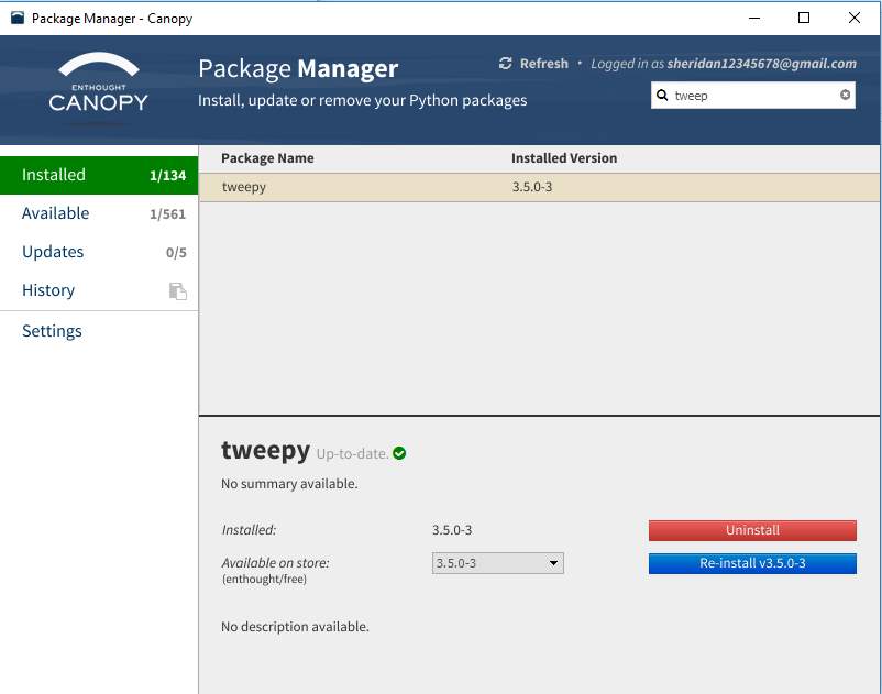
Figure 36-download the package tweepy into Enthought Canopy
Appendix -Section 2- Python scripts used to stream data
A. Python Scripts used to stream sugar tweets:
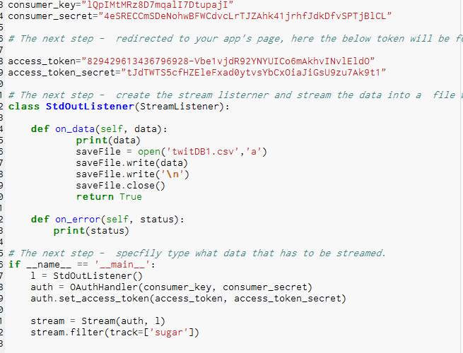
Figure 37- first script to stream data
B. File located in containing the relevant tweets:
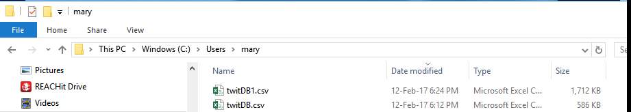
Figure 38- The file which contains the tweets
C. Output of file in Notepad:
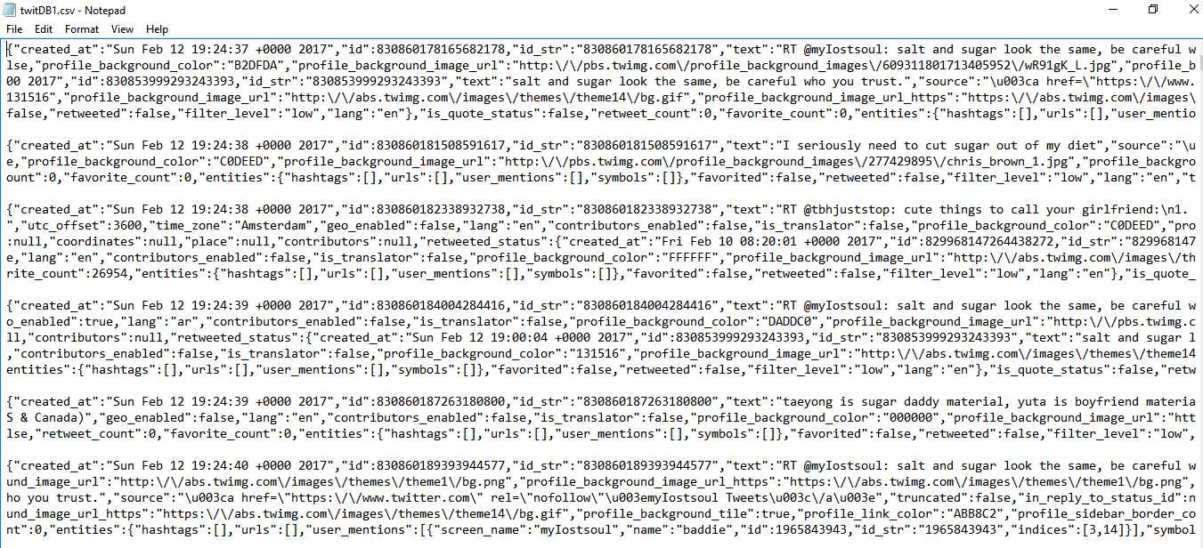
Figure 39- Output tweets in a notepad
D. Append script to show split tweets only:
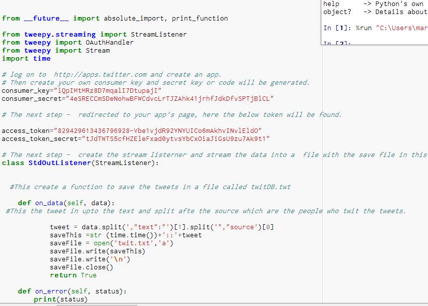
Figure 40- This code spilt the tweet
E. Output of spilt tweets in Notepad:
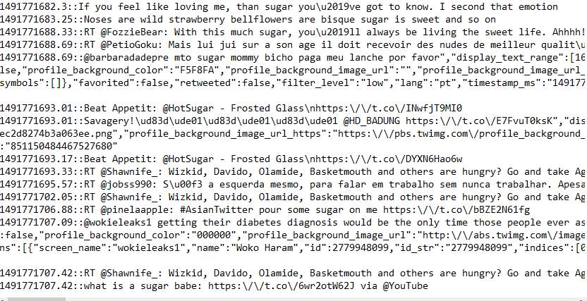
Figure 41- The output of the split code
F. Script used to produce chart:
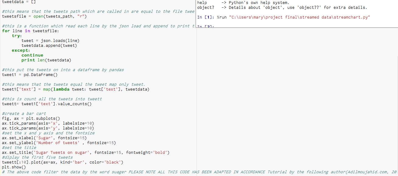
Figure 42- Scripts to produce the chart
Appendix-Section 3 – Cleaning and preparing the data
A. Script used to apply the describe command and the results from the command:
Figure 43- Command for describe
B. Python scripts used to produce charts before cleaning and preparing the data:
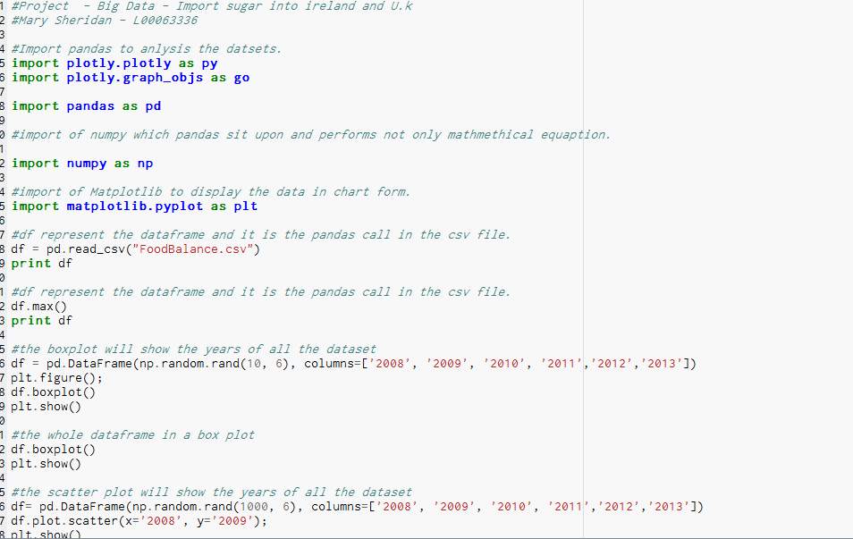
Figure 45-Python script creating charts
1.B – Charts -Bootstrap:
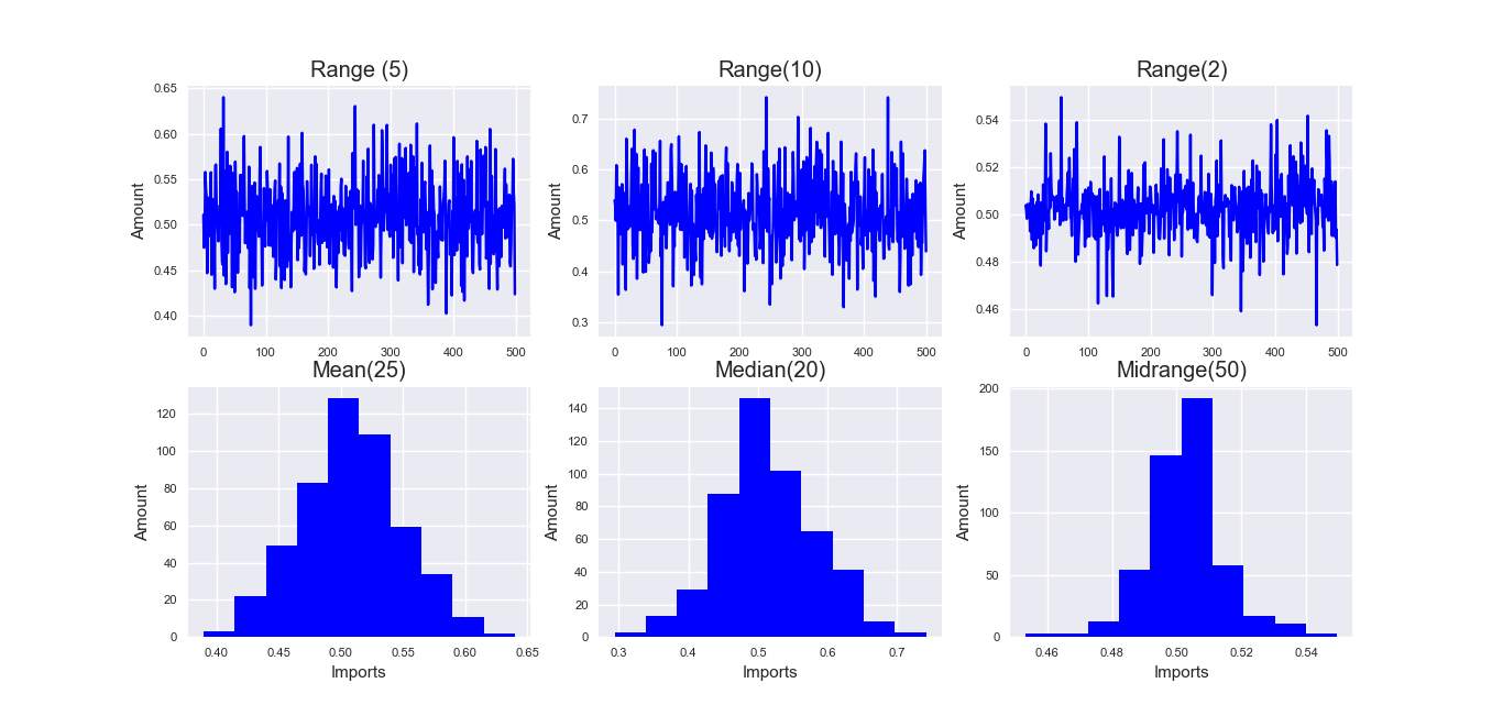
Figure 46-Bootstrap Chart before clean
Whole csv file – Box Plot:
Figure 47- Box plot before clean
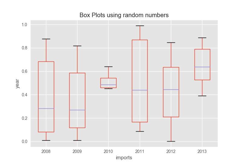
Box plots using random numbers:
Scatter plot for groups:
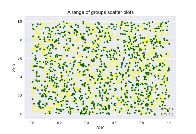
Figure 49- Scatter plot before clean
Line charts:
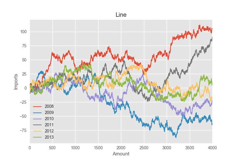
Figure 50- Line chart before clean
C. Python Code – cleaning and preparing the data
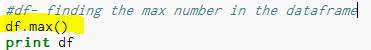
Figure 51- Command to get the max
The head of the dataframe

Result
Print the tail of the dataframe

result of end of the dataframe
Make a copy
Show the data types
Figure 57- Show the data types
Result
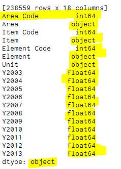
Figure 58-Prints out the types result
Delete columns
Result
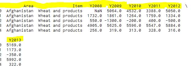
Figure 60- Result of the deleted columns
Rename columns
Result
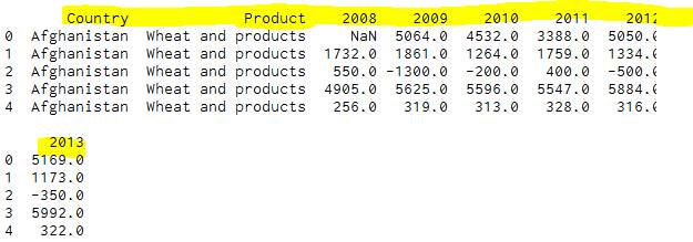
Figure 62- Result of the figure 59
Remove the na values

Result
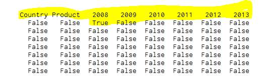
Figure 64- Result of the nas
Removing the na value
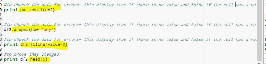
Figure 65- Alternation of the file
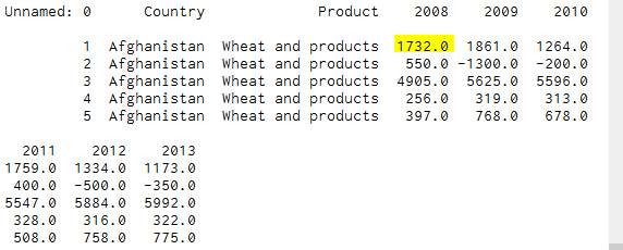

Figure 67- Number of rows and columns
Extract file Ireland record into csv file.
Appendix -Section 4 –second dataset -world rise in diabetes:
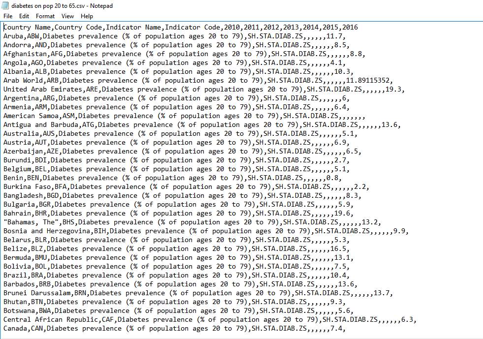
Figure 69- Output the diabetes
Import the dataset into canopy
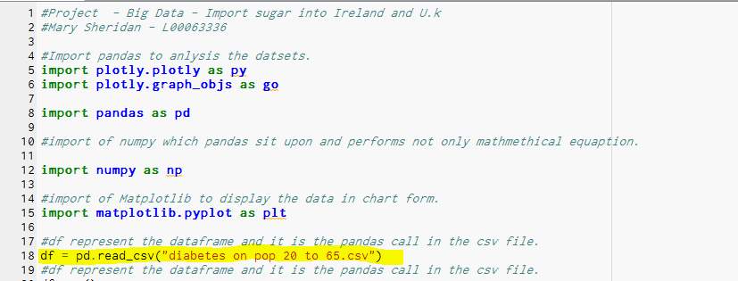
Figure 70- File import to canopy
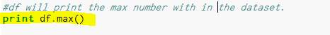
Print max number of with in the dataframe
Result – 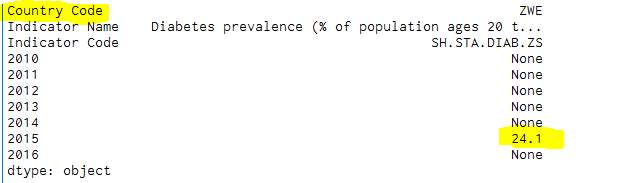
Box graph
This show the max and all the countries together and very hard to read but show if any values are not correct or out of range.
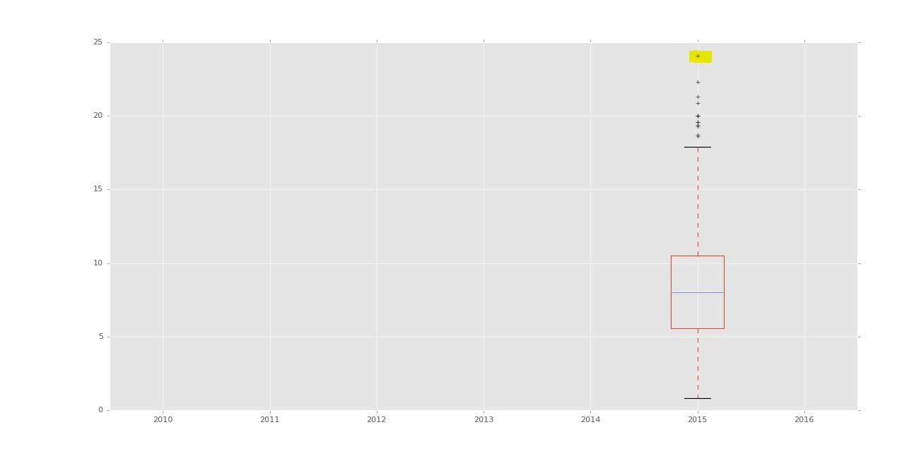
Figure 73- Box chart before clean
Another charts to show the max and how unreadable the information is
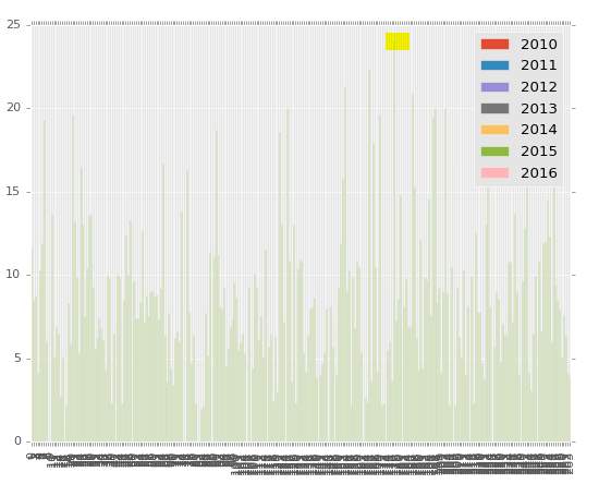
Figure 74- Chart to show diabetes
Clean the data
This prints the first records of the dataframe.
Result
From this it is clear that there are several columns that are not required
The one marked with Nan and that the dataframe consist of 264 rows and 11 columns.
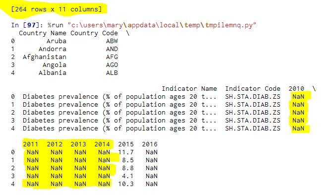
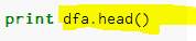
Figure 76- Print out the dataframe
Copies the dataframe into the dataframe into dfa.
Deletes the columns
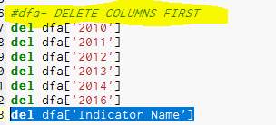
Figure 78- Removes the columns
Results
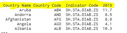
Figure 79- Result the of figure 76

Figure 80- The rows and columns
This prints the head of the dataframe
Show the Na of the dataframe.
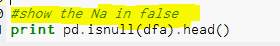
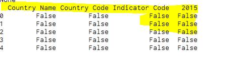
Figure 83- Show the false in the result
To drop na values.

Result after na droped
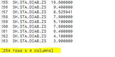
To remove the indicator code column
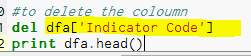
Result
Save as clean csv file

Saved the file into windows/users/mary
Appendix -Section 5 – Scikit-Learn – Demo File
5.1 General Health file
Follow tutorial on (Udemy, 2017)
5.2 Output result of Cluster:
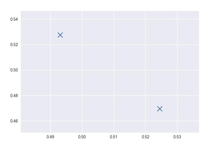
Figure 91- Chart of the general file
5.3 Comparing cluster:
Ref (Udemy, 2017)
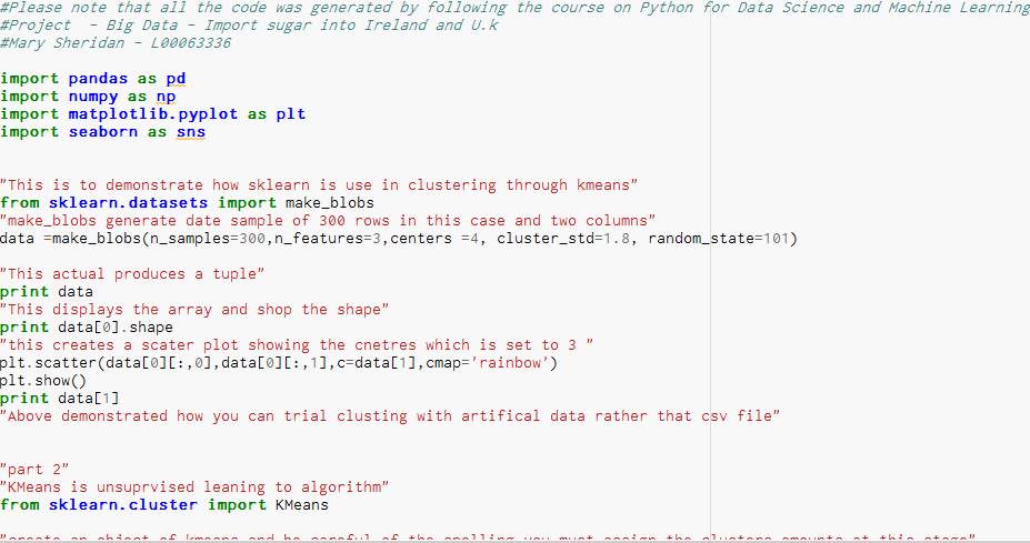
Figure 92- Example of Clustering
5.4 Result of the comparing cluster:
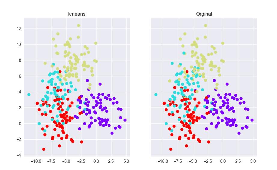
Figure 93- Result of Clustering
10.0 Timetable of Study
References
Adilmoujahid.com. (2017). An Introduction to Text Mining using Twitter Streaming API and Python // Adil Moujahid // Data Analytics and more. [online] Available at: http://adilmoujahid.com/posts/2014/07/twitter-analytics/ [Accessed 9 Feb. 2017].
Auer, S., Martin, M., Stadler, C. and Ermilov, I. (2013). CSV2RDF: User-driven CSV to RDF mass conversion framework. [online] Available at: http://challenge.semanticweb.org/2013/submissions/swc2013_submission_18.pdf [Accessed 5 Nov. 2016].
Brownlee, J. (2016). Supervised and Unsupervised machine learning Algorithms. [online] Available at: http://machinelearningmastery.com/supervised-and-unsupervised-machine-learning-algorithms/ [Accessed 31 Oct. 2016].
Damian.Loscher (2015). 14-050310-Healthy Ireland survey 2014-2015 report (draft 1). [online] Available at: http://health.gov.ie/wp-content/uploads/2015/10/Healthy-Ireland-Survey-2015-Summary-of-Findings.pdf [Accessed 1 Nov. 2016].
Data.worldbank.org. (2017). Diabetes prevalence (% of population ages 20 to 79) | Data. [online] Available at: http://data.worldbank.org/indicator/SH.STA.DIAB.ZS [Accessed 19 Feb. 2017].
Diebold, F. (2012). A personal perspective on the origin(s) and development of ‘big data’: The phenomenon, the term, and the discipline, Second version by Francis X. Diebold: SSRN. http://papers.ssrn.com/sol3/papers.cfm?abstract_id=2202843, [online] second(Scholarly Paper No. ID 2202843). Available at: https://papers.ssrn.com/sol3/papers.cfm?abstract_id=2202843 [Accessed 2 Nov. 2016].
Enthought Canopy. (2016). canopy-subscriptions. [online] Available at: https://www.enthought.com/canopy-subscriptions/ [Accessed 9 Nov. 2016].
Fao.org. (2017). FAOSTAT. [online] Available at: http://www.fao.org/faostat/en/#data/FBS [Accessed 10 Feb. 2017].
Fawcett, S. and Waller, M. (2013). Data science, predictive Analytics, and big data: A revolution that will transform supply chain design and management. Journal of Business Logistics, 34(2), pp.77-84.
Frank, E. and Witten, I. (2005). Data mining: Practical machine learning tools and techniques, Second edition. Morgan Kaufmann.
Greiner, L. (2011). What is data analysis and data mining?. [online] Available at: http://www.dbta.com/Editorial/Trends-and-Applications/What-is-Data-Analysis-and-Data-Mining-73503.aspx [Accessed 18 Oct. 2016].
Haider, M. and Gandomi, A. (2015). Beyond the hype: Big data concepts, methods, and analytics. International Journal of Information Management, [online] 35(2), pp.137–144. Available at: http://www.sciencedirect.com/science/article/pii/S0268401214001066 [Accessed 2 Nov. 2016].
Hosking, A. (2012). R: A language for analyzing data. [online] Available at: http://www.splashcon.org/2013/highlights/tutorials/976-r-a-language-for-analyzing-data [Accessed 20 Oct. 2016].
Joseji, L. (2014). 6 sparkling features of Apache spark! – DZone big data. [online] Available at: https://dzone.com/articles/6-sparkling-features-apache [Accessed 24 Nov. 2016].
Kaufman, M., Halper, F., Nugent, A. and Hurwitz, J. (2013). Big data for dummies. John Wiley.
Kaushik, S. and Saraswat, M. (2016). 18 free exploratory data analysis tools for people who don’t code so well. [Blog] 18 Free Exploratory Data Analysis Tools For People who don’t code so well. Available at: https://www.analyticsvidhya.com/blog/2016/09/18-free-exploratory-data-analysis-tools-for-people-who-dont-code-so-well/ [Accessed 20 Oct. 2016].
KDnuggets (2016). Import.io easy visual download and import web data. [online] Available at: http://www.kdnuggets.com/2013/06/importio-easy-visual-download-import-web-data.html [Accessed 11 Nov. 2016].
Leo, D. and Hilborn (2013). Healthcare informational data Analytics by Don Leo Hilborn: SSRN. [online] Available at: https://papers.ssrn.com/sol3/papers.cfm?abstract_id=2362781 [Accessed 18 Oct. 2016].
Li, A. (2015). MDM is foundational to big data. [online] Available at: http://www.semarchy.com/semarchy-blog/mdm-is-foundational-for-big-data/ [Accessed 18 Oct. 2016].
Macmillan Publishers Limited (2014). INTERACTIVE NOTEBOOKS: SHARING THE CODE. [online] Available at: https://www.iris.edu/hq/files/agendas/2015/usarray_15/PythonNotebooks-Nature.pdf [Accessed 17 Nov. 2016].
Marcus, A. and Maletic, J. (2000). Data Cleansing: Beyond Integrity Analysis. [online] Available at: http://citeseerx.ist.psu.edu/viewdoc/download?doi=10.1.1.37.5212&rep=rep1&type=pdf [Accessed 20 Oct. 2016].
McKinney, W. (2012). Python for data analysis: Data wrangling with Pandas, NumPy, and IPython. “O’Reilly Media, Inc.”.
Mitchell, T. (2002). Machine learning. [online] Available at: http://personal.disco.unimib.it/Vanneschi/McGrawHill_-_Machine_Learning_-Tom_Mitchell.pdf [Accessed 25 Oct. 2016].
Ott, T. (2016). Tips & tricks: How to use python and R with RapidMiner. [online] Available at: https://rapidminer.com/tips-tricks-how-to-use-python-r-rapidminer/ [Accessed 4 Nov. 2016].
Pandas.pydata.org. (2017). Merge, join, and concatenate — pandas 0.19.2 documentation. [online] Available at: http://pandas.pydata.org/pandas-docs/stable/merging.html [Accessed 19 Feb. 2017].
Plot.ly. (2017). Online Graph Maker · Plotly. [online] Available at: https://plot.ly/create/ [Accessed 19 Feb. 2017].
plotly. (2016). Visualize Data, Together. [online] Available at: https://plot.ly/ [Accessed 15 Nov. 2016].
Pope, C. (2016). Budget 2017: Tax on sugary drinks to be introduced in 2018. [online] Available at: http://www.irishtimes.com/news/ireland/irish-news/budget-2017-tax-on-sugary-drinks-to-be-introduced-in-2018-1.2825833 [Accessed 18 Oct. 2016].
RapidMiner (2016). RapidMiner reviews: Overview, pricing and features. [online] Available at: https://reviews.financesonline.com/p/rapidminer/ [Accessed 20 Oct. 2016].
RapidMiner studio (2013). RapidMiner studio. [online] Available at: https://rapidminer.com/products/studio/ [Accessed 20 Oct. 2016].
Rouse, M. (2016). What is machine learning? – definition from WhatIs.com. [online] Available at: http://whatis.techtarget.com/definition/machine-learning [Accessed 21 Oct. 2016].
Russom, P. (2011). BIG DATA ANALYTICS FOURTH QUARTER 2011 TDWI besT pracTIces reporT introduction to big data Analytics. [online] tableau. Available at: http://www.tableau.com/sites/default/files/whitepapers/tdwi_bpreport_q411_big_data_analytics_tableau.pdf [Accessed 18 Oct. 2016].
Ryan S J D Baker (2010). Data mining for education. [online] Elsevier. Available at: http://users.wpi.edu/~rsbaker/Encyclopedia%20Chapter%20Draft%20v10%20-fw.pdf [Accessed 18 Oct. 2016].
Sánchez-Lozada, L., Benner, S., Kang, D., Feig, D., Nakagawa, T., Sautin, Y., Segal and Johnson, R. (2007). Potential role of sugar (fructose) in the epidemic of hypertension, obesity and the metabolic syndrome, diabetes, kidney disease, and cardiovascular disease. The American journal of clinical nutrition., [online] 86(4), pp.899-906. Available at: https://www.ncbi.nlm.nih.gov/pubmed/17921363 [Accessed 9 Nov. 2016].
SANNER, M. (1999). PYTHON: A PROGRAMMING LANGUAGE FOR SOFTWARE INTEGRATION AND DEVELOPMENT. [online] Available at: http://citeseerx.ist.psu.edu/viewdoc/download?doi=10.1.1.35.6459&rep=rep1&type=pdf [Accessed 20 Oct. 2016].
Scikit-learn.org. (2017). scikit-learn: machine learning in Python — scikit-learn 0.18.1 documentation. [online] Available at: http://scikit-learn.org/stable/ [Accessed 15 Nov. 2016].
Seaborn.pydata.org. (2016). Seaborn: statistical data visualization — seaborn 0.7.1 documentation. [online] Available at: https://seaborn.pydata.org/ [Accessed 15 Nov. 2016].
sentdex. (2017). Cleaning up Tweets: How to use the Twitter API v1.1 with Python to stream tweets. [online] Available at: https://www.youtube.com/watch?v=AtqqVXZ365g [Accessed 9 Feb. 2017].
Shenker, S., Franklin, M., Chowdhury, M. and Zaharia, M. (2016). Spark: Cluster computing with working sets. [online] Available at: http://static.usenix.org/legacy/events/hotcloud10/tech/full_papers/Zaharia.pdf [Accessed 11 Nov. 2016].
Shook, C. and Ketchen, D. (1996). The application of cluster analysis in strategic management research: An analysis and critique. Strategic Management Journal, [online] 17(6), pp.441-458. Available at: http://www.jstor.org/stable/pdf/2486927.pdf?seq=1#page_scan_tab_contents [Accessed 5 Nov. 2016].
Sinanc, D. and Sagiroglu, S. (2013). IEEE Xplore document – big data: A review. [online] Available at: http://ieeexplore.ieee.org/document/6567202/authors [Accessed 18 Oct. 2016].
Stackoverflow.com. (2017). Stack Overflow. [online] Available at: http://stackoverflow.com/ [Accessed 18 Feb. 2017].
Taieb, D. (2015). Sentiment Analysis of Twitter Hashtags. [online] Available at: https://developer.ibm.com/clouddataservices/2015/10/06/sentiment-analysis-of-twitter-hashtags/ [Accessed 24 Nov. 2016].
Talwalkar, A., Zaharia, M., Zadeh, R., Franklin, M., Xin, R., Xin, D., Owen, S., Amde, M., Tsai, D., Freeman, J., Liu, D., Venkataraman, S., Sparks, E., Yavuz, B., Bradley, J. and Meng, X. (2016). MLlib: Machine learning in Apache spark. Journal of Machine Learning Research Helix Dr, [online] 17. Available at: http://www.jmlr.org/papers/volume17/15-237/15-237.pdf [Accessed 7 Dec. 2016].
The DataCamp Team (2015). Choosing R or python for data analysis? An infographic. [online] Available at: https://www.datacamp.com/community/tutorials/r-or-python-for-data-analysis#gs.v5SaaIw [Accessed 20 Oct. 2016].
tutorialspoint (2016). Software Requirements. [online] Available at: https://www.tutorialspoint.com/software_engineering/software_requirements.htm [Accessed 15 Nov. 2016].
Udemy. (2017). Python for Data Science and Machine Learning Bootcamp. [online] Available at: https://www.udemy.com/python-for-data-science-and-machine-learning-bootcamp/learn/v4/announcements?ids=836834 [Accessed 18 Feb. 2017].
youtube.com/user/sentdex. (2017). sentdex. [online] Available at: https://www.youtube.com/user/sentdex [Accessed 19 Feb. 2017].
Cite This Work
To export a reference to this article please select a referencing stye below:
Related Services
View all


Related Content
All TagsContent relating to: "Statistics"
Statistics is a branch of applied mathematics concerned with the collection and analysis of numerical data. The term statistics is also used to describe the facts that are obtained from the collection and analysis of that data.
Related Articles
DMCA / Removal Request
If you are the original writer of this dissertation and no longer wish to have your work published on the UKDiss.com website then please: